|
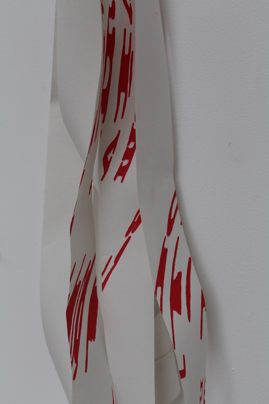
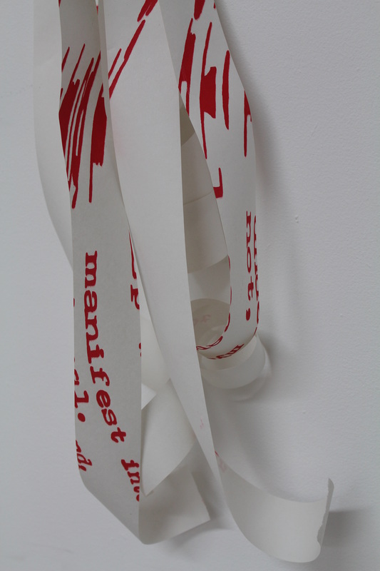
Inspired by the unconventional reading approach demonstrated in “Babel: Contemporary Art and the Journeys of Communication”, I have attempted to adapt my screen prints to incorporate an element of the three-dimensional, as frequently used in 2D-3D imagery and 3D films. Using colour is an unusual step for me as I would not normally be drawn to use them as boldly in my work. Red and Blue are already used frequently in media to create a 3D effect and I feel that these two colours layered together with my text motif makes the resulting image stand out from the paper much more than black ever could. Continuing to print on graph paper has also helped the motif to stand out whilst maintaining a manufactured 3D effect. If you look at these prints through red or blue coloured acetate, whilst one colour on the page disappears the other stands out and appears black. If you look through red and blue acetate at the same time – one colour in front of each eye like 3D glasses – the text really shifts in front of your eyes, and “reading” what is there becomes very difficult. The potential to make 3D glasses would enable the viewer to engage with this work in several ways and produce different viewing/reading experiences. 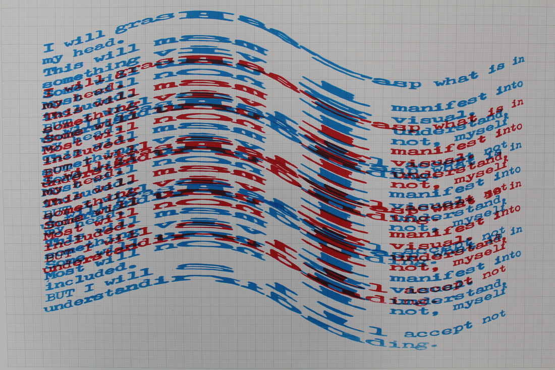 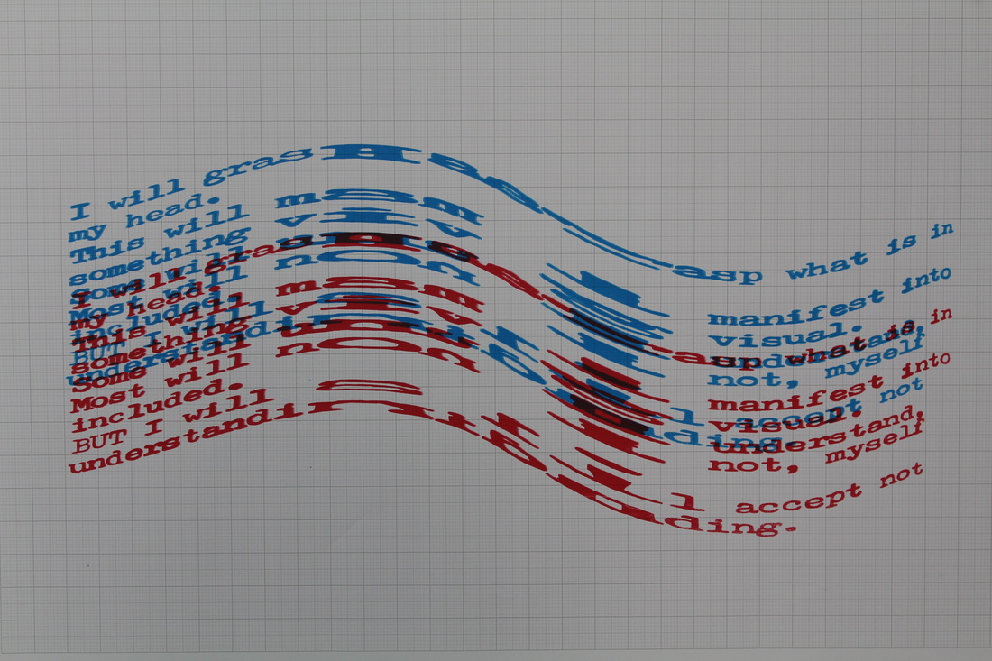 I have also continued with an ongoing theme of the linear – and used till roll receipts to print on. These have then been manipulated as individual strands to form larger collaged pieces alternating in colour and level. The results play with the aesthetics of the patterns of the motif more than the readability of the text itself, but this process has also allowed me to focus on small parts of the overall print as highlighted by individual layers of the paper. 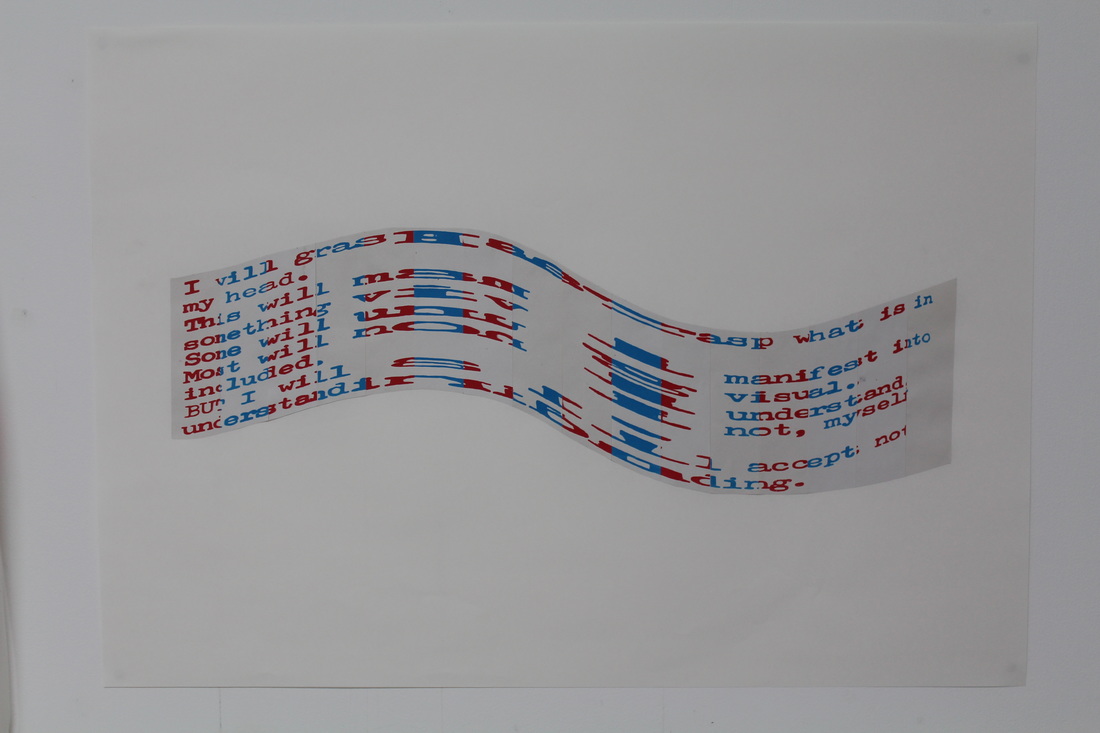 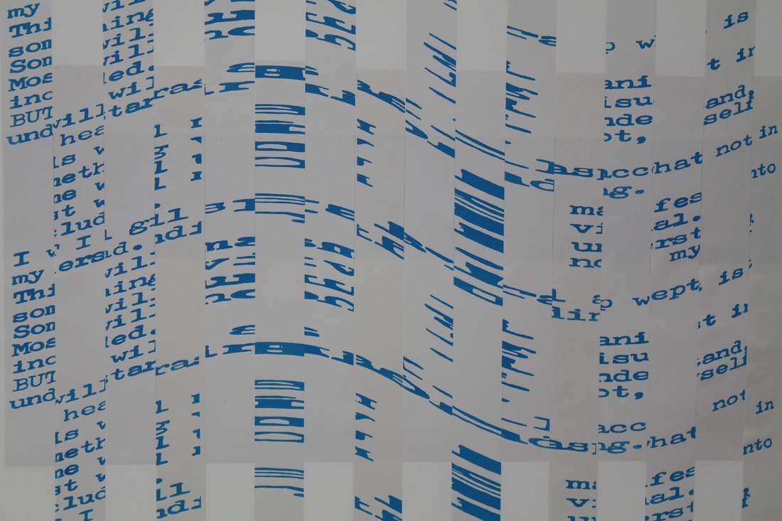
0 Comments
Leave a Reply. |