|
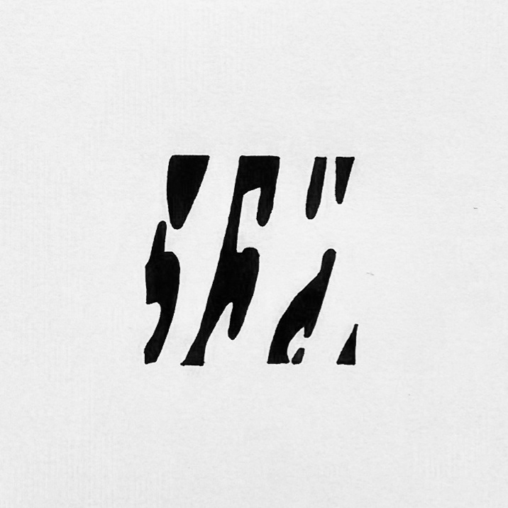
Whilst in the print room I have been able to go back to an idea I have been trying out over the summer using off-cuts from my manifesto screen prints that I made before the summer break. Weaving these off-cuts together create an interesting grid with intersecting pathways of text at different orientations. Parts of the print where the text had been stretched beyond recognition become isolated within the structure of the grid, allowing me to select them to be re-printed on their own. This process highlights the formative nature of the distorted text rather than its meaning when read conventionally. Initially I am printing them on a small scale so that the viewer can focus on one small element of what is essentially part a much larger piece. Without any prompt the textual origins are ambiguous to the viewer.
0 Comments
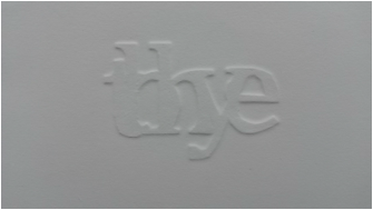
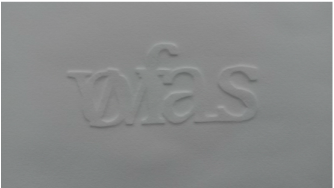
Ideas for my studio practice have been developing quickly from the number of things I have been doing alongside one another. I have found that when layered on top of one another, the conjunctions I have been working with form interesting ‘anti-words’; giving the illusion of a real word initially but later revealing itself as anything but real. Layering of these non-keywords form a new visual language, and have been likened to old languages like Latin when they have been seen in my studio by my peers. What’s more interesting is that these ‘new’ forms are only the result of merging two regular words in almost constant use. These visually striking motifs have given me the perfect material to experiment with blind embossing paper for the first time since I had the idea last year. I have cut the shapes from grey board by hand and layered these with wet paper through a printing press to create the emboss. I have found that the thicker the paper the better the effect of the emboss. 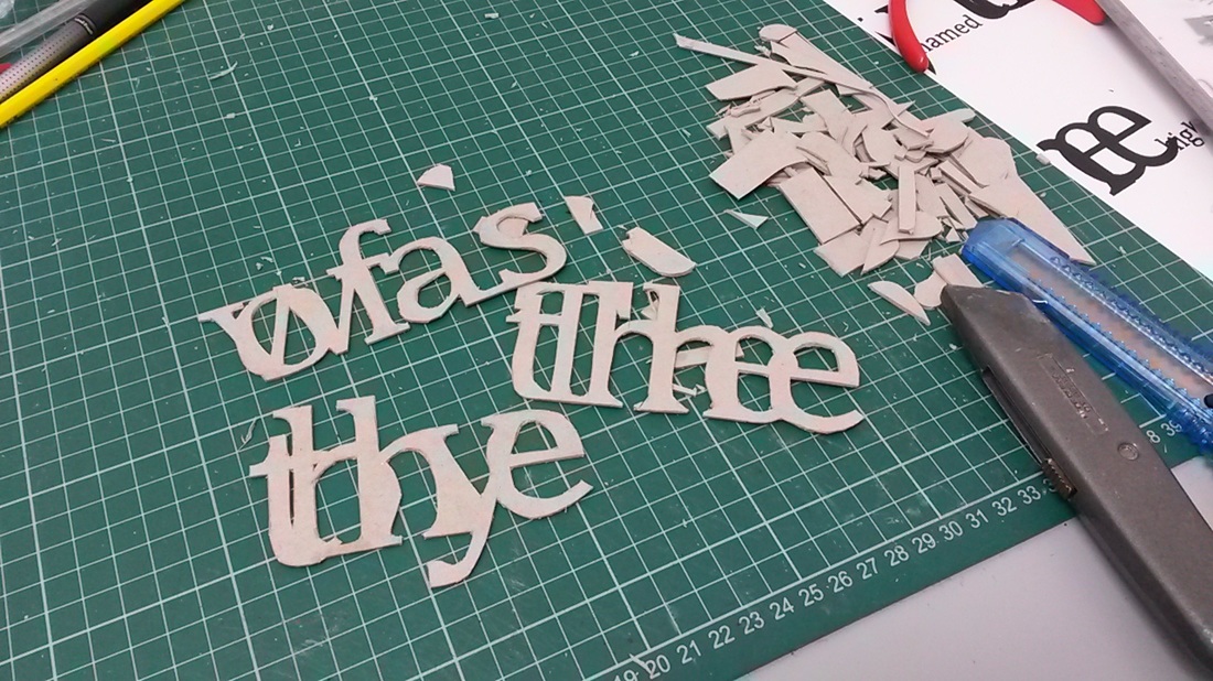
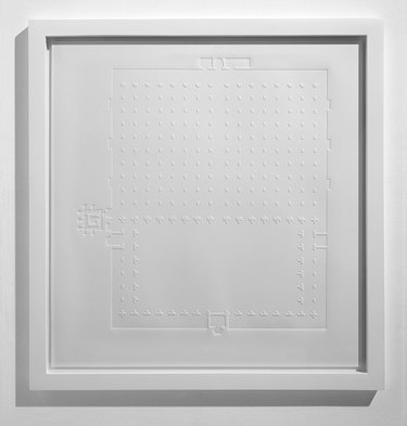
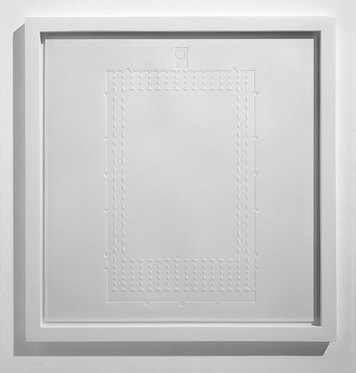
I have been finding it difficult to find other examples of artists using embossing in their work, the only example being Langland and Bell’s architectural pieces on Somerset paper. These geometric pieces utilise small shapes to create a raised floorplan on paper. Here zinc plates are used to create the emboss, and I am hoping that I will be able to trial a number of different materials using a laser cutter to enable the use of more materials other than grey board and to make the cutting process easier.
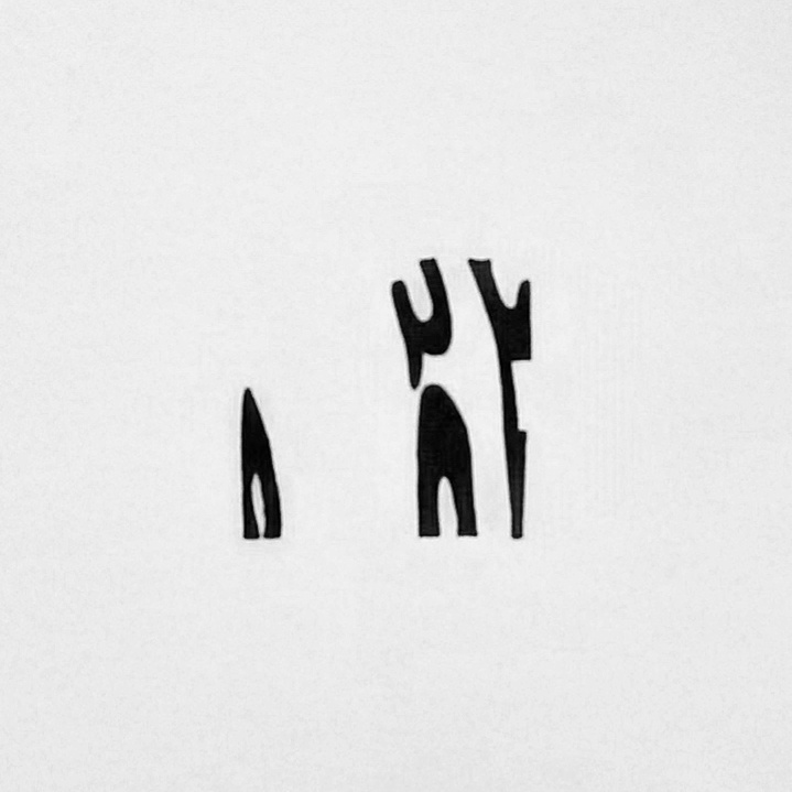
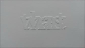
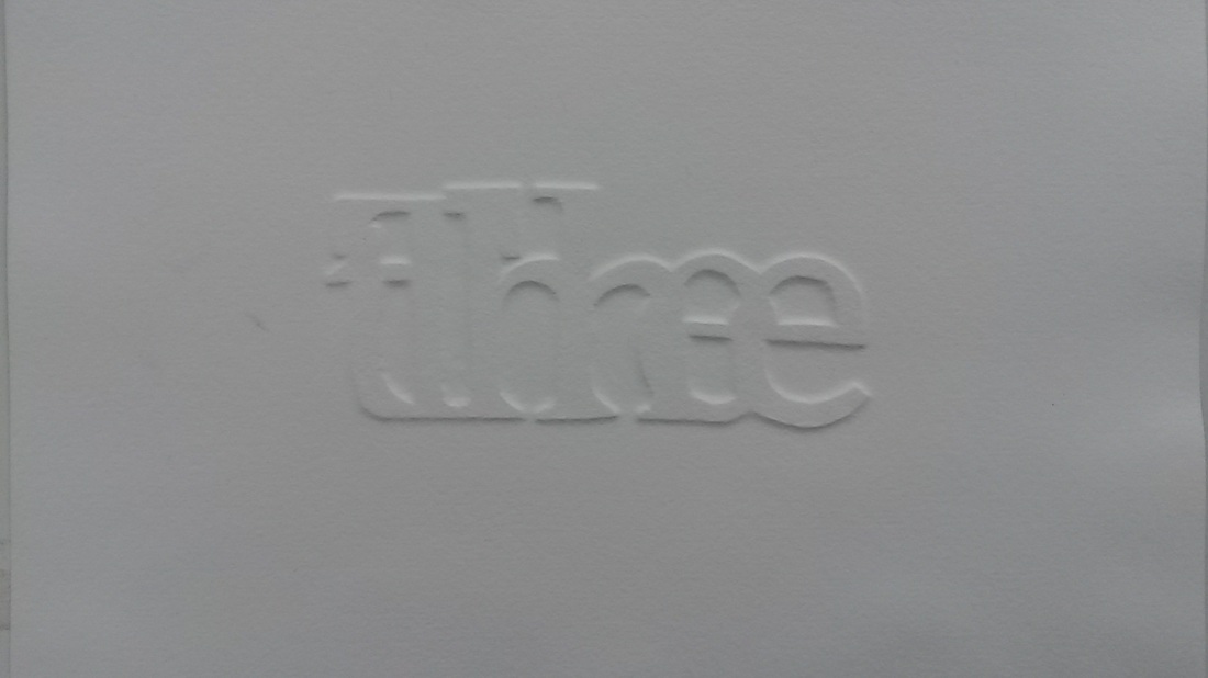
I have also tried combining this process with screen printing to try and create more depth to the shape of the letters. When completely lined up, I can’t say that I can see a huge difference, but the further off-set the emboss is to the printed letters, the more obvious the two processes are to see. These initial trials have proved successful, and I want to pursue this with larger and more complex designs when I have an easier cutting process to utilise. 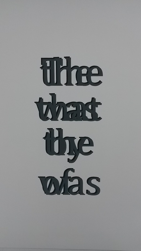 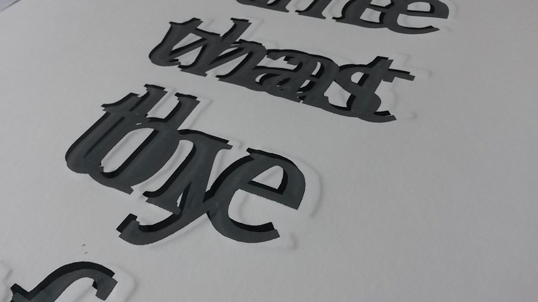 Whilst using my source text to make the linear transfers I was paying close attention to the syntax of the speech. I began to focus on the keywords and how in any piece of text it is these words that would be picked out if you were to skim-read it to identify the basic concept behind the writing. “FALMOUTH // UNIVERSITY // STUDY // STUDENT”. But what if I were to invert this concept? If I were to focus on conjunctions and other ‘non-keywords’, how could the text be identified against any other? “AND // OF // THE // WAS // BE” Visually, to highlight these types of words could potentially form an unusual visual ‘fingerprint’ – by omitting or reducing the size of other words to leave these behind. I have initially tried this by reducing the size of all other words on the page, and presenting the results in a linear format that allows the conjunctives to make a visual statement on the page. 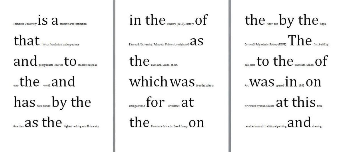 The keywords no longer hold the identity of the text; a new visual identity is captured by the placement of conjunctives on the page. Each text has its own unique use of these words that will be shown when compared to other texts. I would like to collect a number of texts, either existing or written by me, and to standardise the font/size/layout of them so that the patterns are easily comparable between each other. I have wanted to use the formative nature of text to form larger shapes that can hold their own as a geometric form rather than a traditional ‘body’ of text. Using an extremely small font size reduces the words to have a more linear quality, and repeating this makes a grid. It is only decipherable as text when looked at extremely closely.
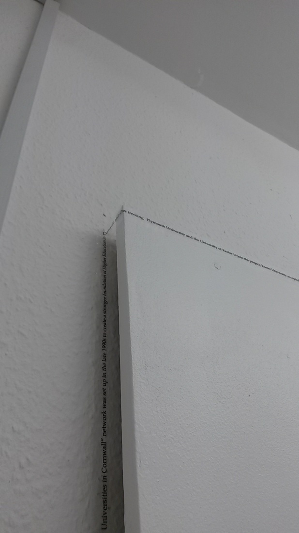
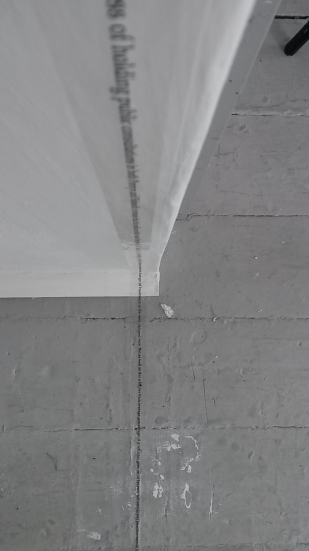
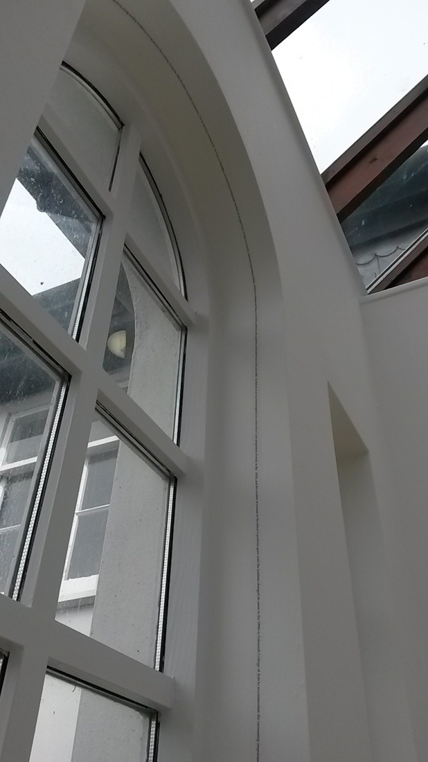
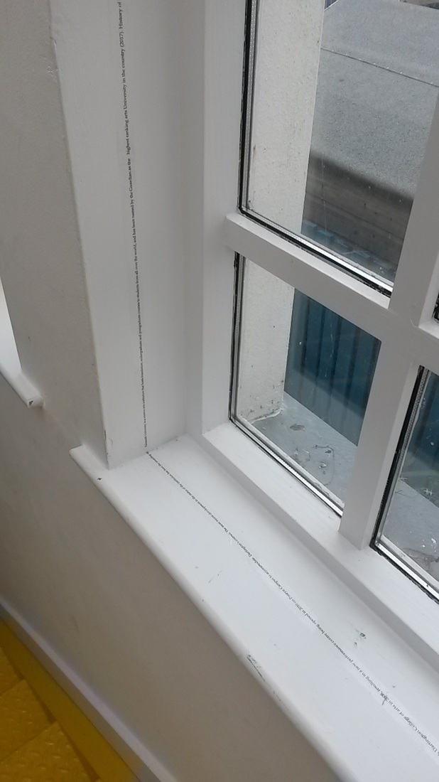
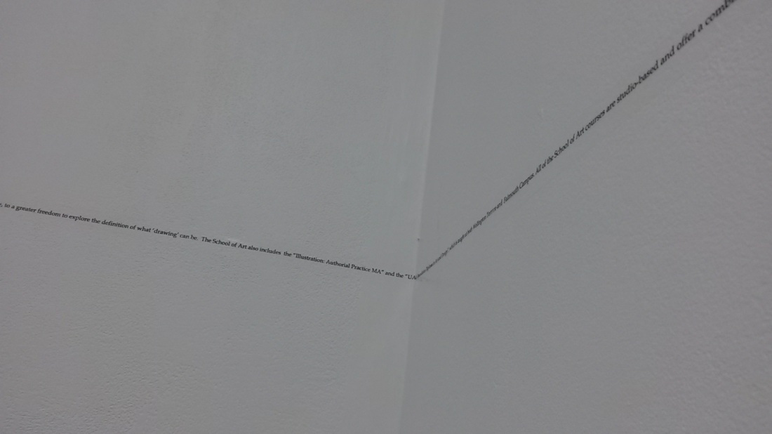
I liken this process to when the meaning of a word is ‘lost’ when it is repeated over and over. The more that the word is repeated, the more unrecognisable it becomes. For me, whenever I come across the words “for instance”, I am reminded of this feeling and I can rarely say the words out loud without the phrase sounding alien to me. For instance is the phrase used in an initial experiment where typed text is reduced to point 1 in size. The break from second to third year has meant that my practice has paused over the summer period. Despite this break away from the studio I have still been keen to continue with the work I had been making at the end of my second year. As a matter of course the start of a new year has meant a new studio and course tutor. With this has come a new perspective to my practice and the direction my work can take. After speaking with my tutor about the potential of my work I was asked how I would occupy a whole building with my work if it were possible. The thought of a single line of text that travelled throughout the building occurred to me, and the potential of making site-specific works became apparent. To begin with, I have used my studio building as a location for this type of work. Using a speech I had written about the history of Falmouth University I printed and transferred lines of the text onto clear sellotape and use the specifics of the architecture to plan the route the tape would take. The linear qualities of the text are emphasised due to the single ‘line’ that is used in this process, and the smaller the text, the more it appears as a line and less as text. I have trialled this procedure in several locations in my studio building, but with the potential of taking the text out and into the wider environment; making the texts that are installed there specific to that location. The method that I have used initially has been on a small scale but letter transfers could be used if the location required something more robust. The scale could also be altered if the location required it, but at present I like the use of small size fonts to cross the boundary between the work being seen as a line and seen as a text. 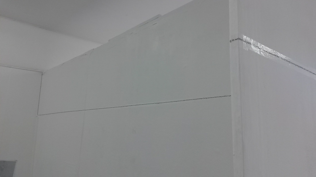
|