|
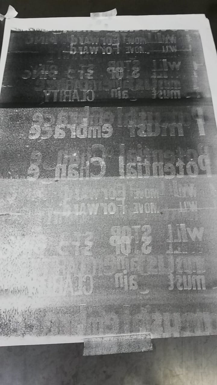
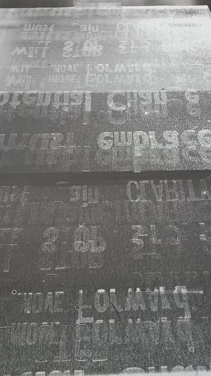
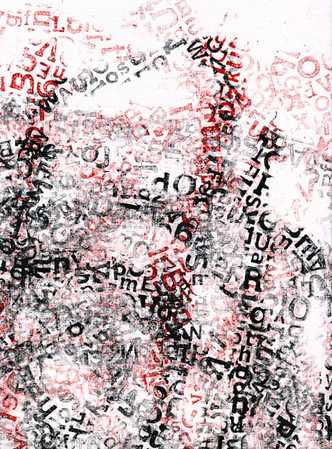
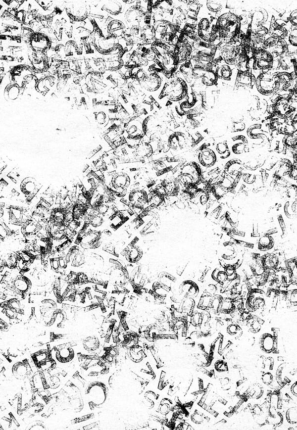
Following on from my initial use of a roller in combination with letterpress to create mono prints, I have taken this one step further by bypassing making direct prints from the letterpress blocks and using them as a means to make larger roller mono prints. Taking another of my manifestos to work with, I tried printing with just a single roll of the roller over the letters as well as printing when the roller has been across the letters multiple times to pick up the shapes of the letters more than once. When you roll over the letters once the print makes it easy to identify discrepancies where a letter has been missed or is not fully reproduced on the roller, however the shapes that are made are interesting motifs that could stand alone as a form of “anti-text”. Multiple uses of the roller over the same letters produce a far busier and less linear result with several versions of the statement overlapping. 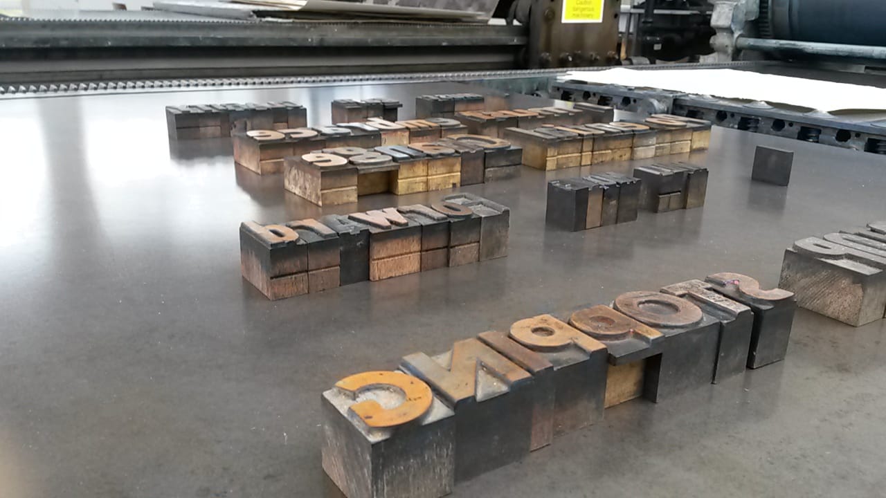 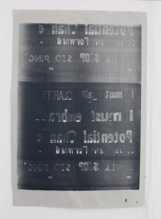
The process also produced an extra print on the letters themselves, showing a slight off-set from the original letters.
To try and get the resulting printed text the right way round I also tried first rolling the ink onto aluminium and then taking the print from there, The result is effective, however this does make the print hazy with more imperfections from the sheet of metal, there are too may degrees of separation from the letterpress blocks here. 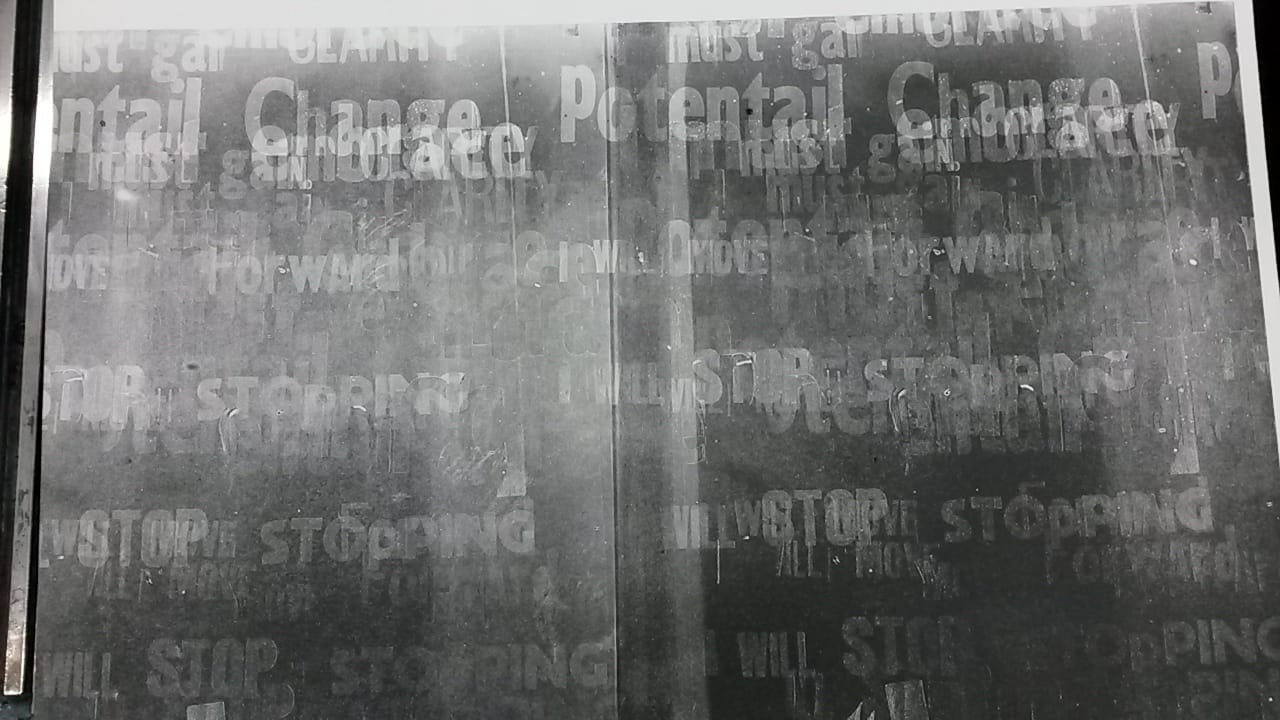 What proved slightly more successful was printing from the roller directly onto acetate, giving the same level of crispness of the print whilst allowing the letters to be seen the right way round through the clear plastic. Whilst the direct prints have their own charm I think that the future of this work will be through screen print once I have successful roller prints on acetate, as I can edit the imagery and use the more stable printing process to create layers. Once this has been created I could go on to use other processes on top. 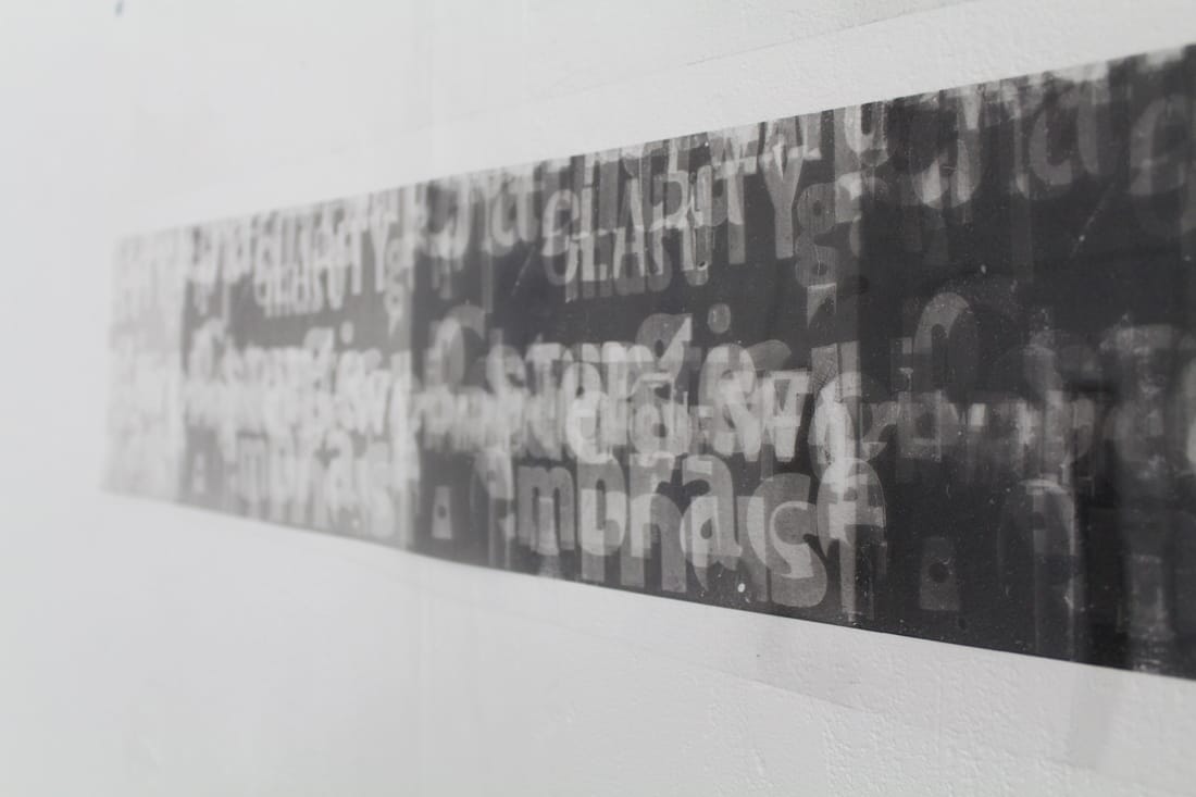 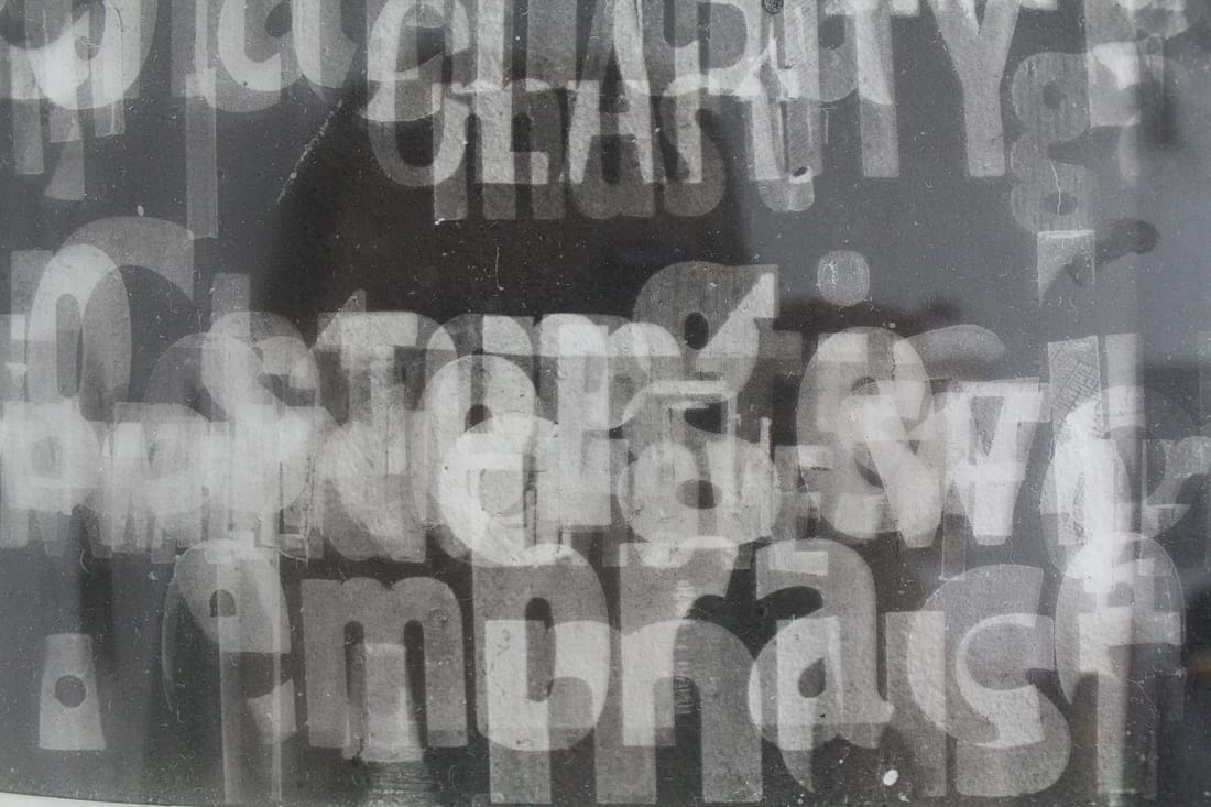
0 Comments
Hew Locke is Falmouth University’s new visiting professor of Fine Art. After graduating from Falmouth in the 80s Locke has been working as a sculptor and installation artist and has shown his work nationally and internationally. In particular I have found his wall pieces the most inspiring, taking inspiration from banners and flags, Locke glues objects onto the wall to create his own coat of arms. The cord and beads that are used to outline the historic figures and strange creatures are left hanging down, giving the appearance of a worn out piece of tapestry; left as a visible que to the works’ historical contexts. 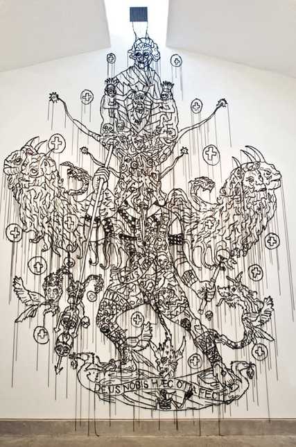 Hew Locke, "Sin Eater", 2008. www.hewlocke.net 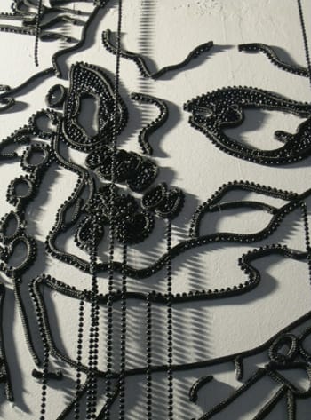 Hew Locke, "Sea Power" (detail), 2014. www.hewlocke.net In a 1-1 discussion with Locke we discussed the difficulties in finding a context for my work and how to work around it. It was clear that the work that I have been making up until now looks very design orientated, even though that is far from its intention. What was highlighted in my work was my installation piece using a single line of text to occupy a space, which I should continue to develop and if possible, to find a company that can print vinyl lettering so that the appearance is a little sharper. I could then use this single line to bring together a number of other works, seeing as my current practice is so eclectic. We also discussed my roller mono prints. Locke agreed that a larger roller should be used, and to treat the process like a painting and take the process as far as it can, with the potential to print onto fabric with other additions made using other printing techniques, and then stretch it onto a frame. Even if these prints aren’t successful, I want to make them to be able to clear my head space.
Whilst making letterpress prints I made an accidental discovery of a process that produces unique and unpredictable prints using the printing roller. Rolling ink over the letter blocks leaves a negative image behind on the roller, and when the remaining ink from the roller is rolled out onto paper the resulting mono print is a linear matrix of the initial letters. 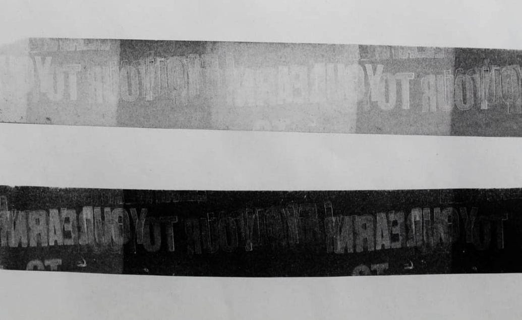 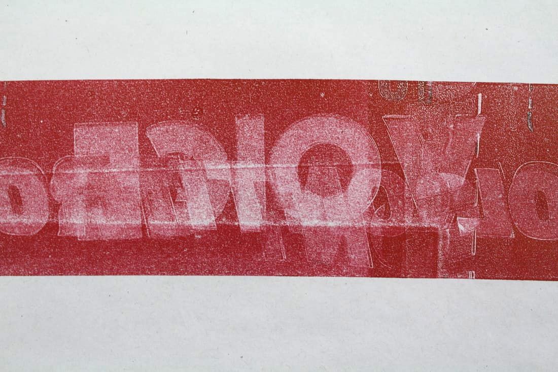 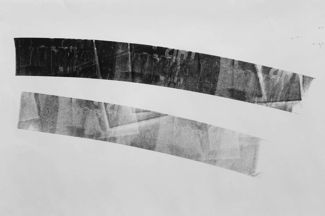 If one colour is already on the letters when you roll over them with a different colour, the negative spaces become positives in the resulting two-tone print. 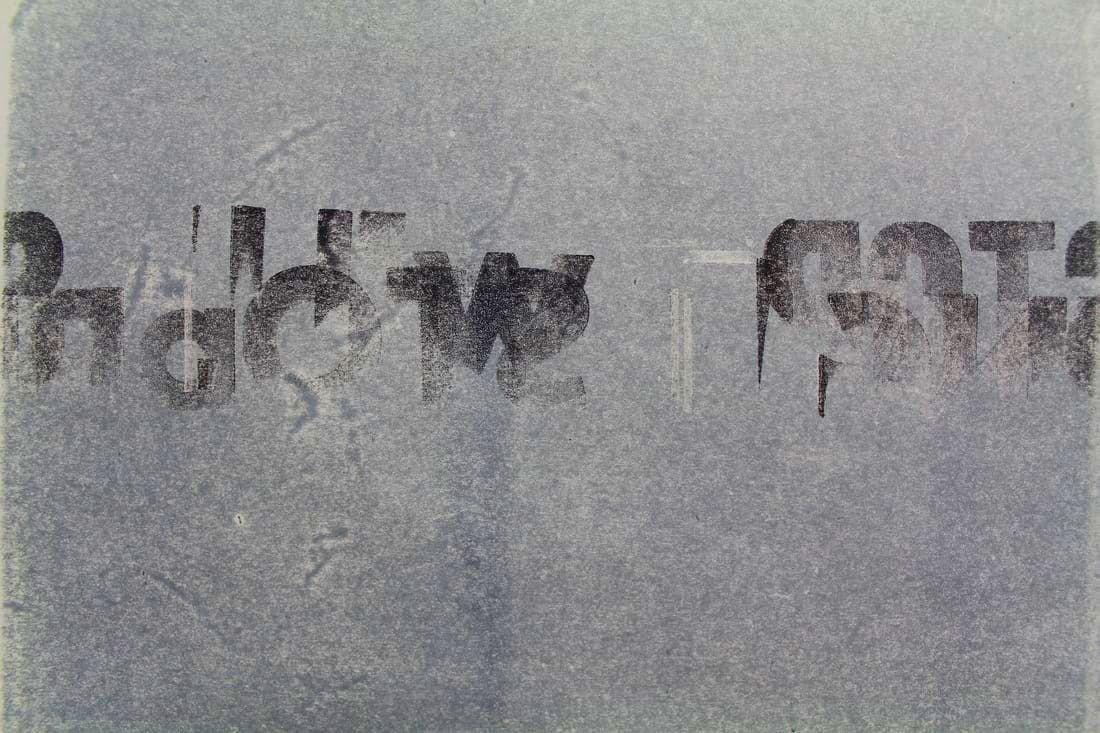 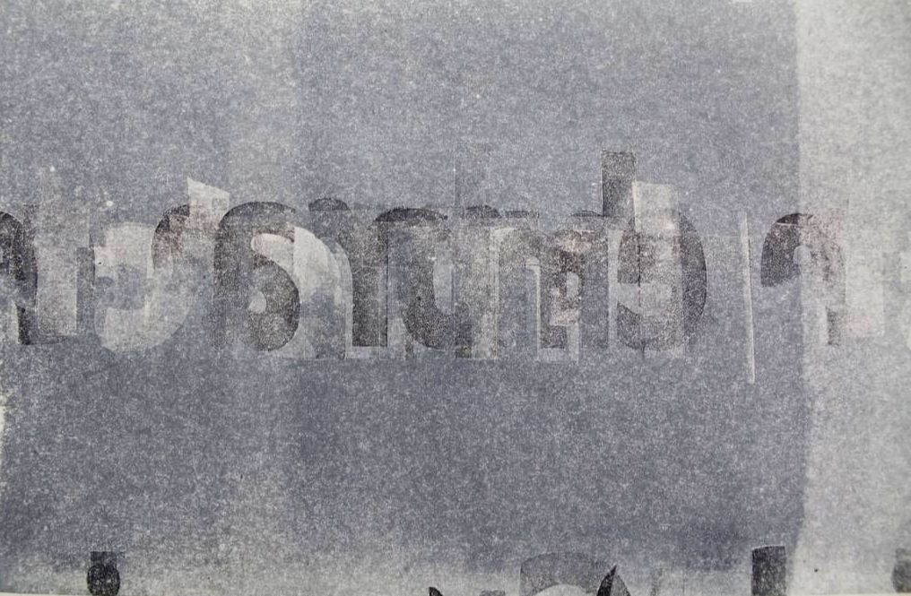 This process is one similar to that of Eric Calderon’s “Typography Sphere”. Described as an “artist book”, Calderon’s sphere demonstrates how a process can be as much of a piece of artwork as the outcome. Calderon describes; “An artist's book. A book as an artwork, an artwork as a book. Inspired by the arts and craft movement as well as the Bauhaus functionalism, I created my own kind of art tool. The painter has his brush, the carpenter his hammer, I have my typographic ball. A book that writes itself. A piece in constant change.” The sphere is adorned with a number of cut out letters, that when inked up produce a matrix of overlapping lines with different combinations of the letters. The sphere itself is in essence the source material from which an infinite number of outcomes can be produced; no two prints from the sphere are ever the same. The more that the ball is rolled the more dense the resulting image. More layers of ink muddy the image, and the text becomes more difficult to read. No story or grammatical sentence is spelled out on the ball in the first place, therefore any words or structures that appear are coincidental. 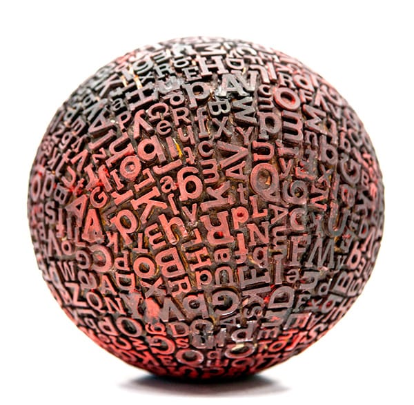 Eric Calderon, "Typographic Sphere". www.behance.net
I find that these types of mono print are more interesting than original letterpress prints, as they are more in keeping with my aims of disrupting the reading process. I would like to take the kinetic process further with more rolled prints. Their unpredictable nature however makes it difficult to be sure if any one print will be very visible, or that all of the letters have been included. The nature of the roller also means that the line that is produced is split into blocks of decreasing levels of ink. Initially I have only used rollers with a small width so that they roll over the desired letters on the printing bed, but if I were to pursue this process any further I would like to see how a larger roller would work.
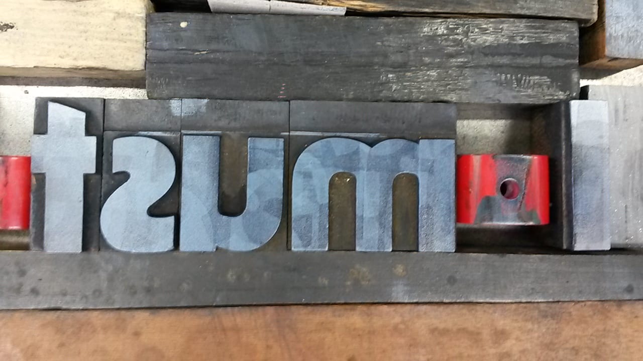
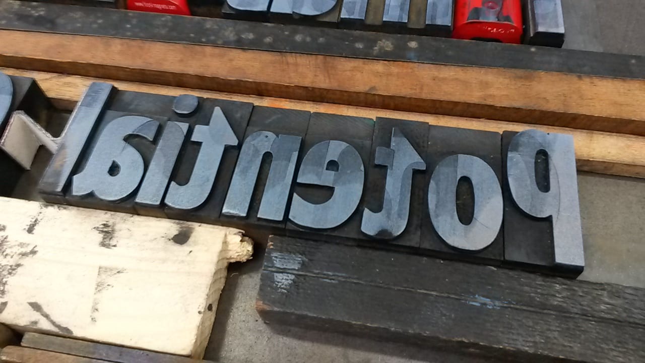
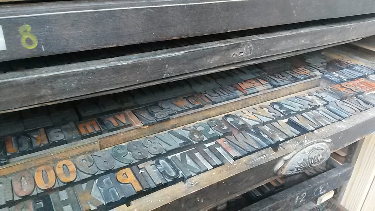
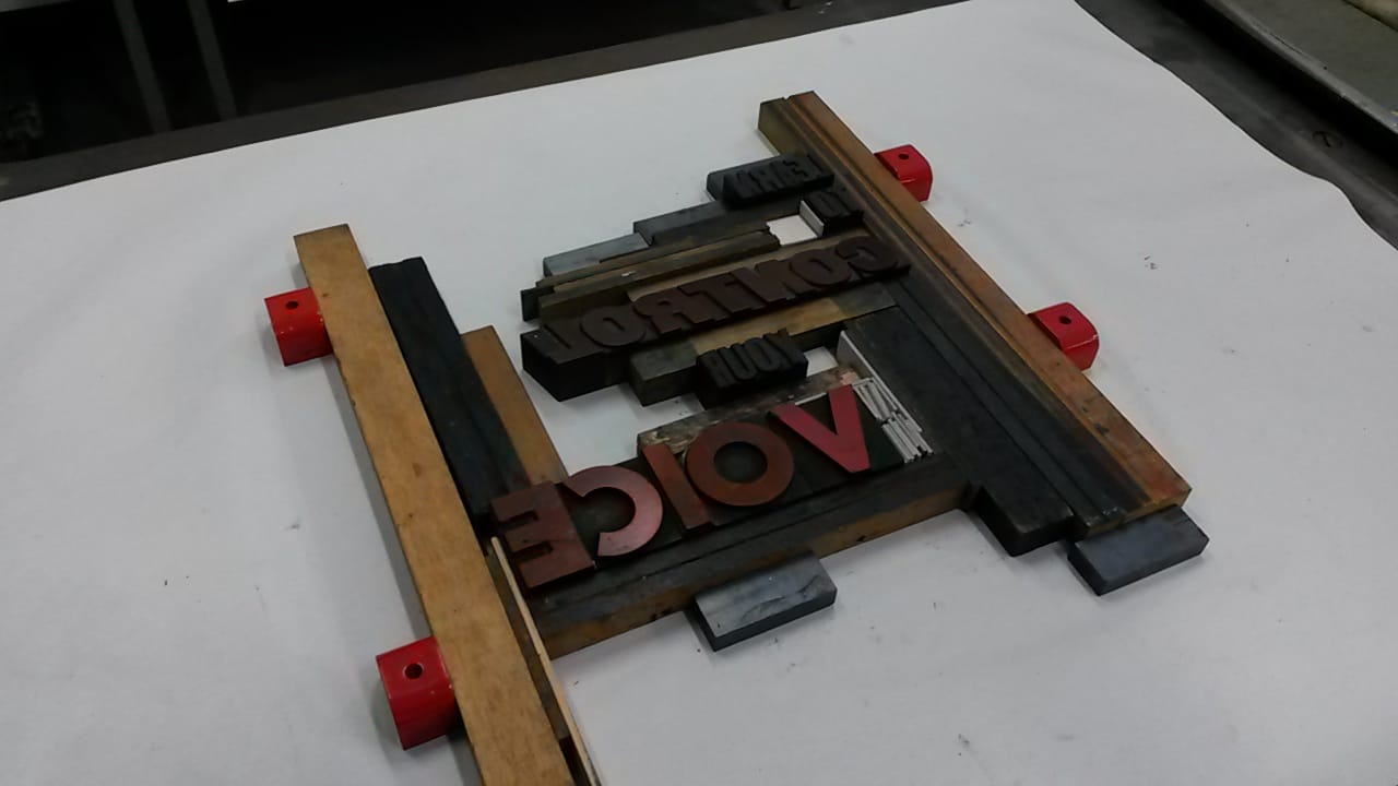
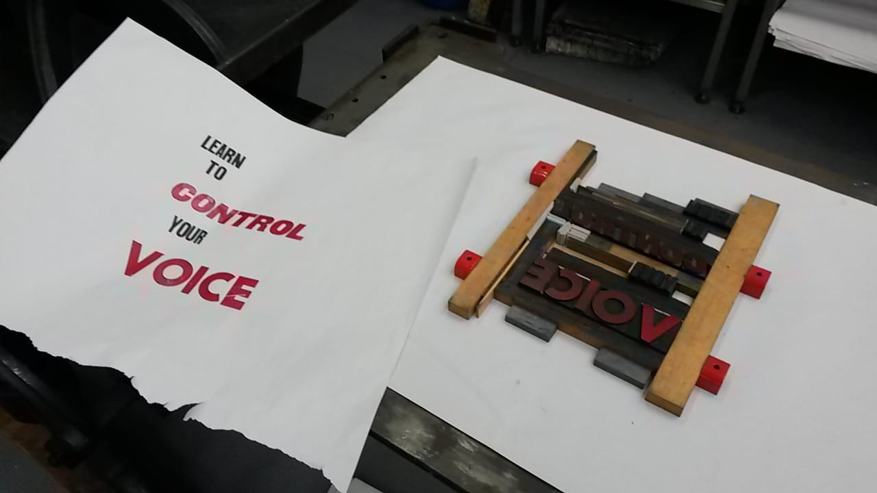
The print room has recently acquired a small collection of letter blocks for letterpress printing. It is a second hand set that has seen a lot of wear and tear which has resulted in there being very few fonts with only a handful of each letter. The additional blocks required to hold all of the letters in place are also missing so it is a matter of using offcuts of wood to create a manageable surface to ink up and print from.
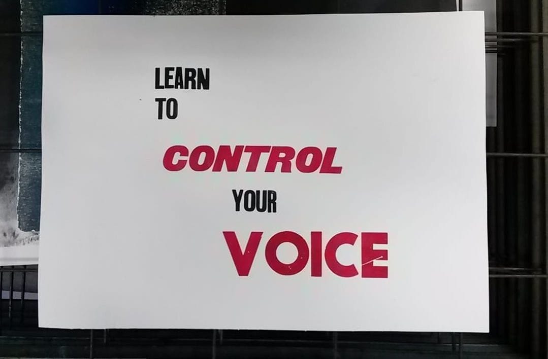
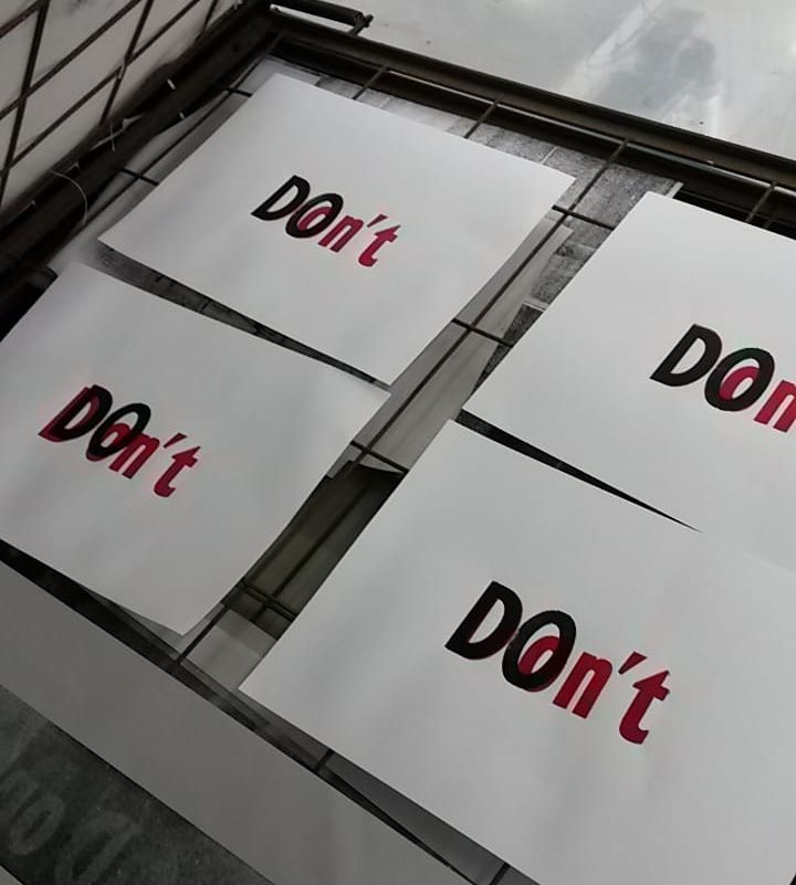
To test out the process I recreated one of my manifestos. Its instructive tone lead me to use black and red inks initially, which gives the print a striking appearance, although similar to a design to be used as a sign on a wall as opposed to a more aesthetic purpose. Although these initial prints were done on white printing wove there is the potential to combine this process with other processes to build up a more textured or busy surface, which could be the solution to making the print seem less design orientated.
I also tried over-printing, again using red and black inks to create a distinction between two words; in this case the commands DO and DON’T. I wanted to see if there was a possibility of opposing words coming together to create a single merged body, where the words have to be extracted from the whole in order to be understood.
The process of overprinting is tricky to be able to get the letters to lie over the top of each other exactly; this is proven in most of my attempts where a distinction between the two words is more obvious than intended. The composition however works better as a resolved print because of the motif that is created, and the process of unpicking the individual letters that takes place to be able to “read” the image. 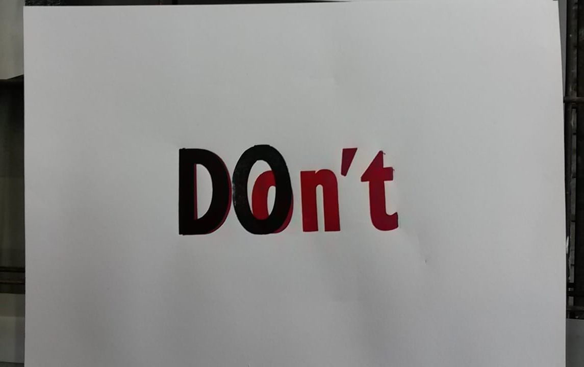
However there are other examples of work out there that use this overlay technique but the processes used to create the work mean that another dimension is explored in the viewing experience. James Clar’s light works use filters to block out certain parts of long florescent tubes, whilst exposing other parts so that they light up the wall behind them.
“Lover’s Quarrel” filters out the letters to spell “leave” on the fronts of the tubes, whilst the backs of the tubes have had other parts exposed so that it reads “don’t” backwards. At first the different lights combine to create one hazy colour, yet on closer inspection it is possible to see the two words separately. The same technique has been used on other works including “The End” and “Focus”, where the back of the light tubes are just as integral to the work as the front, each spelling out an additional part of the piece. 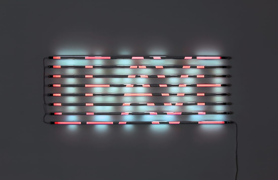
James Clar, "Lover's Quarrel" 2011. www.jamesclar.com
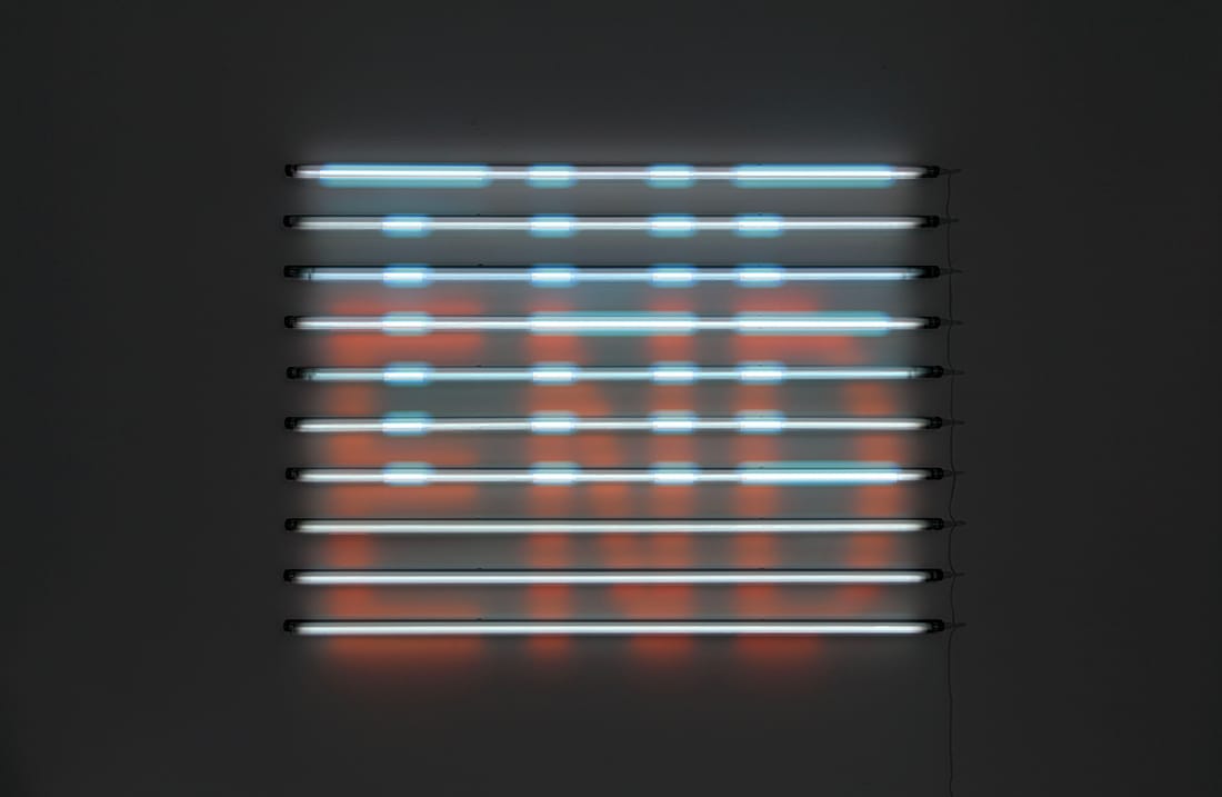
James Clar, "The End", 2012. www.jamesclar.com
James Clar, "Focus", 2012. www.jamesclar.com
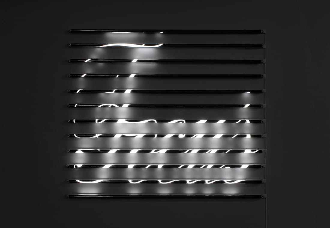
Sara Morawetz creates lenticular prints, where movement is necessary to reveal the other words present in the work. These prints demonstrate the categorisation of time in the words that are selected, for example “today” and “tomorrow”, or “beginning”, “middle”, and “end”. The movement required to fully experience the work adds another kind of time, and demonstrates the movement of time as the words merge into the next.
I feel that if I were to pursue the process of letterpress printmaking I would first need to identify a means of how to present the resulting print so that it does not appear flat, as it is clearly possible to use text in a way that is more effective at activating the space it’s presented in.
|