|
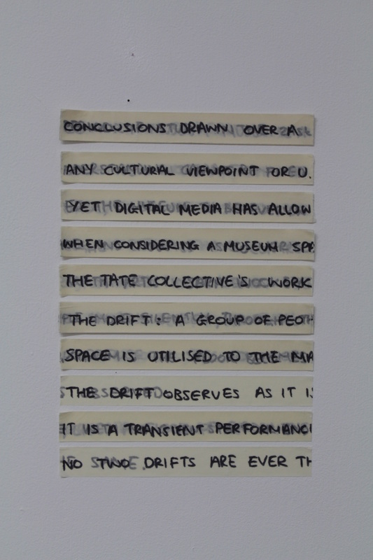
I have created a couple of maquettes showing the layered strips of masking tape on clear acrylic sheets. Each strip has been glued to the plastic along the edge so that the raised edges of the tape are visible at the front. The wooden bracket attaches to the wall just below eye height so that the viewer can get a glimpse of the text and at the same time focus on the edges of the tape. 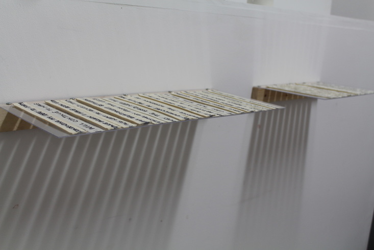
In these examples the differences in height are fairly subtle, I would like to make strips with more height so that I can get a more interesting pattern on the edges. These pieces are successful in presenting the strips horizontally, although the wood securing it to the wall could use a bit of improvement to make it less visible, traditional shelving brackets would have a similar problem. Perhaps in the future a frame could be made whereby the ‘shelves’ are slotted in, much like a book case or a museum’s specimen case. The shadows that are cast when the pieces are installed are more striking than I expected. Similarly to my 3D woven grid, the shadows are an unexpected addition to the work and have the potential to be developed. 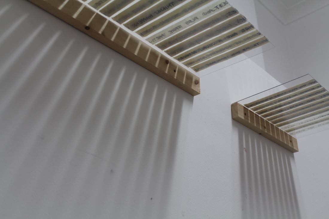 I also found whilst making the pieces that when they were stacked on top of each other the gaps in between each strip revealed the tape on the sheet underneath, reminding me of the potential to involve layering with the acrylic with several sheets. I could also involve kinetics to make the strips move across each other.
0 Comments
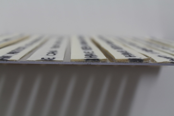
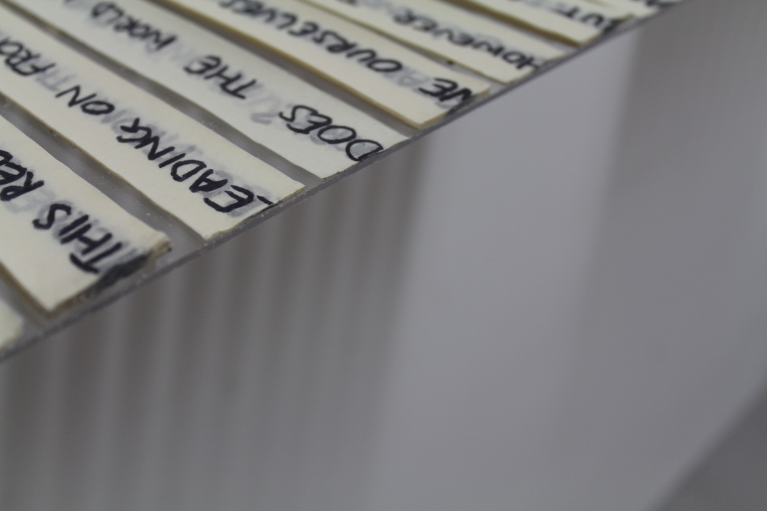
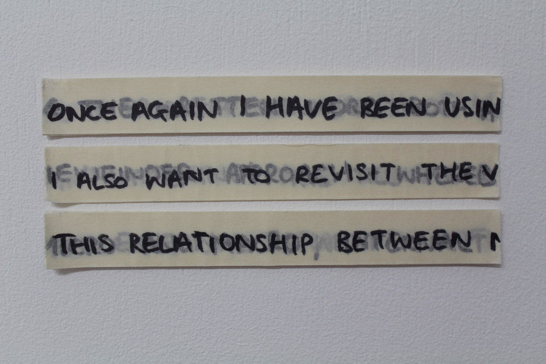
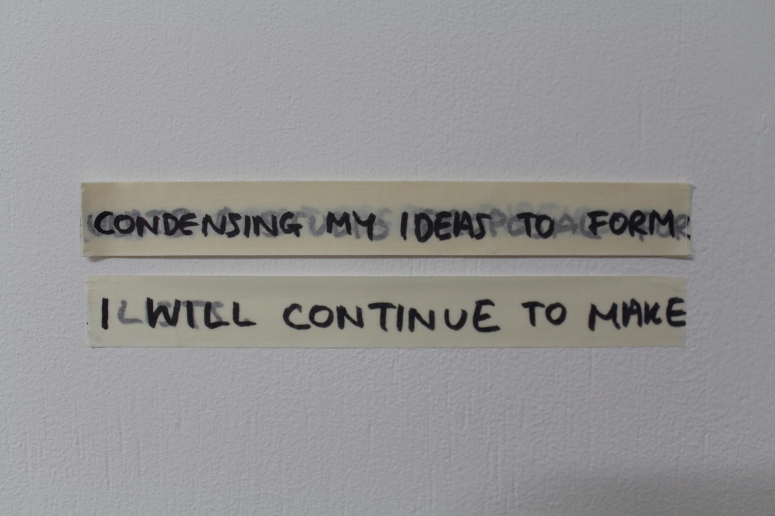
Building up layers of strips of masking tape creates a relief surface where the number of strips dictates how far out from the background they emerge. Initially I wanted to build one single structure- one ‘stack’ signifying a body of text where the act of reading that text would have to go through each layer to discover the next line of writing. But as I have been going through the process of creating the stack I have split the text- in this case posts from my journal- into paragraphs; with each paragraph taking up a different amount of space depending on its length. This process not only creates a more linear-looking conventional ‘body’ of text but it also allows the viewer to see the differences between each paragraph. The edges of each stack also become interesting as they capture the edges of letters; documenting the text but forming an abstract shape as each layer is added.
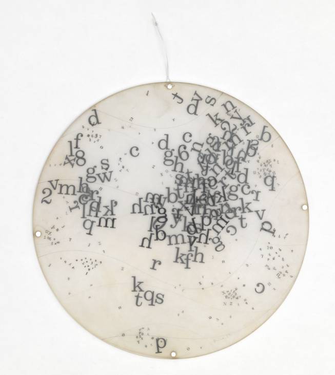
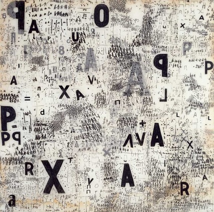
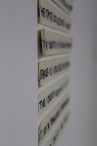 In terms of presentation, these strips seem more appealing from a ‘side’ view – the profile view of the edges of the strips are another way of approaching an incomprehensible text, whilst still creating something visual to be ‘read’. I have been looking into the work of Mira Schendel because of her thorough and extensive body of work revolving around the aesthetic of the written word. Many of her pieces involve capturing numbers, letters, words and pieces of text in clear plastic, denying the ‘right’ way round to look at the work; both the text and ‘anti-text’ (as described in a catalogue of her joint retrospective exhibition with León Ferrari; ‘Tangled Alphabets’) become equally as important. These works also suggest an element of suspense; the letters and words appear to be within touching distance, the potential of altering what has been written is possible right up until you reach the clear plastic that stops any chance of alterations.
 Mira Schendel, 'Graphic Object' 1967. (www.tate.org.uk/whats-on/tate-modern/exhibition/mira-schendel) This relates closely to ideas that I have had about suspending text in vessels. After working with glass jars to see how shredded text would appear I want to continue this line of enquiry by going back to an idea of using resin or plastic.
In the case of the strips I have made, I am now toying with the idea of presenting them horizontally on a shelf of sorts; constructed from clear plastic so the strips appear to be suspended rather than placed. This also keeps the emphasis on the strips rather than on its presentation or placement in a space. |