|
And here in this rain I sit here and thing about what I have done, or more like what I haven’t done. All the things I have told myself that need to be done in order to be successful. I sit here and I beat myself up for the things I haven’t done yet I still sit here and do nothing about it. I am in a constant state of thinking "just think what you could have achieved by now” and yet I still do nothing.
I sit here. I beat myself up because I am never 100% satisfied with anything I make. There is always something missing, room for more. Yet I get to the stage where I don’t want to look at it anymore – I am done with it. Nothing is quick enough for me. I want it all done now. I have no patience. Everyone else has the motivation to just get on with it. They know in themselves what they are doing and what they want. I know neither of these. I am drifting on in a mindless state, feeling guilty but not acting upon it. I know I am capable of great things but my ideas are not worthy; they lack drive, passion. I lack drive and passion. Nothing seems good enough. I keep winding on with other seemingly pointless ventures – none of which lead to an end point that I am satisfied with. I can’t win. I find passion and enthusiasm for other peoples’ work and ideas but not my own. I am too impatient to play the long game. I don’t find solace in my work anymore. I have lost myself. But I need to stop moping about it. I need to stop feeling guilty and start thinking about what it is I actually want right now. Find what I want. Work towards it. Be confident in what I do.
0 Comments
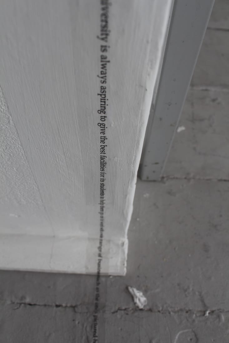
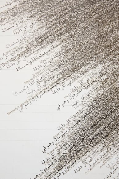
 I have been developing a body of free hand screen prints. Using a small squeegee I have been tracing random lines across the screen to produce abstract outcomes. The more that I use the squeegee the more that the history of previous marks comes through in the prints. No two can ever be the same as the ink on the screen, and therefore the resulting prints, are continuously changing. 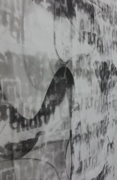 Each print contains parts that are more visible than others, highlighting certain parts of the text whilst other parts are obscured by the ink or become faded beyond the point of recognition. When compares alongside one another however you can see the relationship between the prints, and where parts remain hidden on one they are highlighted on the other. If you want to grasp the whole image you have to look at several of the prints in succession. 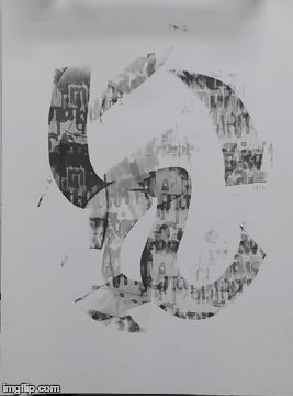 I have tried to stretch some of these prints onto wooden frames to see how they reacted with the wall space they were hung on. I think that together prints with minimal printed material work well, however the denser the print becomes, the more that it is needed to sit on its own. Printing onto fabric has produced different results again, the resulting prints are lighter and almost come away from the fabric’s surface. 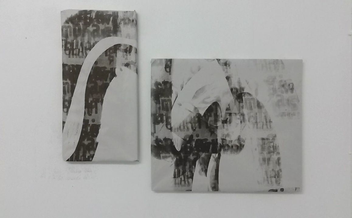 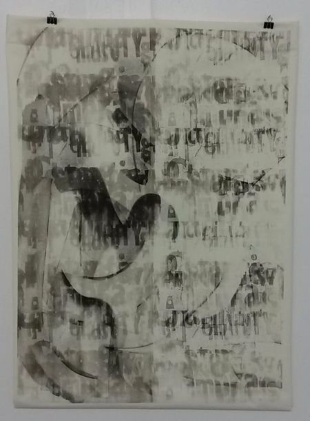 At this stage when I am struggling to find a direction I come back to a question I was asked at the start of the year: “How would you occupy a building with your work?” In terms of developing my work for display, I need to approach the issue with this question in mind. I have been looking back at my earlier attempts to ‘occupy’ a space using a single line of text. With enough time I would love to extend this piece to occupy more of the building I am working in, although the problem I am facing is what text I should use to fill the space. Initially I used information I had written about Falmouth University seeing as I was working in one of their buildings. I am unsure whether to continue to look into the history of the building and the institution or to take the focus of the writing elsewhere. 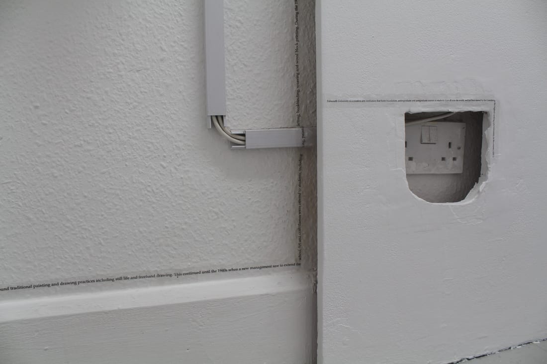
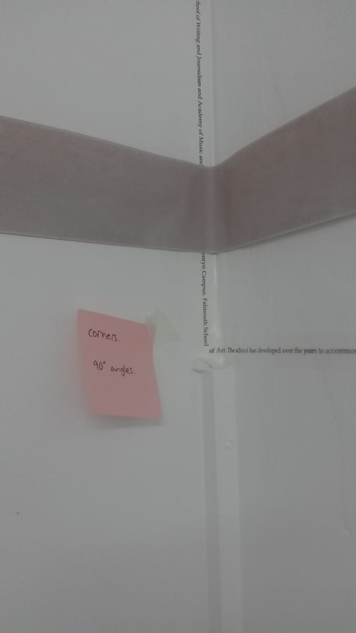
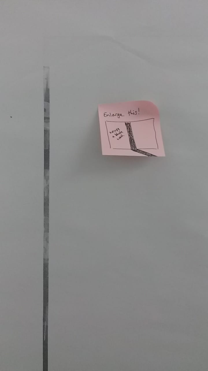
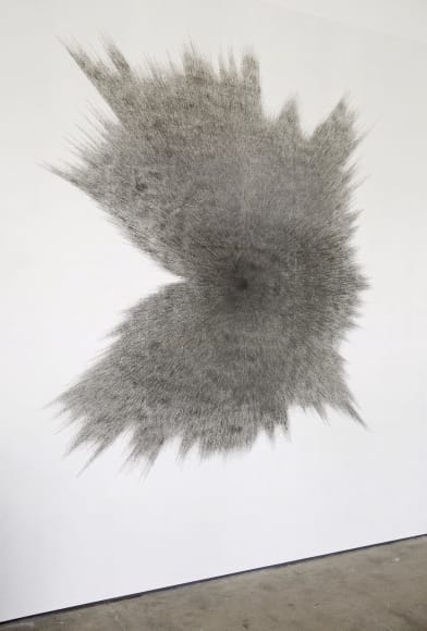
I have also recently been looking into the possibility of more sculptural endeavours with laser cutting and milling, but I also want to explore the potential of free standing pieces which can occupy a space on their own. Fiona Banner’s full stop sculptures are an example of expanding text beyond a state of normal reading- but by examining only the punctuation of different typefaces and blowing them up in a sculptural form to exemplify their differences in even the most simple of signs. I wonder if my laser cutting experiments were to go ahead whether they could occupy the floor space with as much presence as these forms by Banner.  Fiona Banner, "Full Stops", 1998. www.fionabanner.com/works  Fiona Banner, "Momento", 2005. www.fionabanner.com/works/ To me sculptural forms often cry out for further interaction, from light or manipulation of surface. Won Ju Lim and Shin-il Kim both use light and projection to further expand their sculptures; stretching their reach with paths of light that are obstructed in part by the 3D forms they are projected through. It more active form of information rather than a free standing sculpture or projected image. Perhaps this is how my printed images can activate the space they are in, by being manipulated so that light can be projected through them, or they they can be projected onto another object. 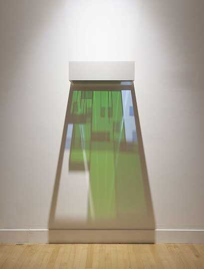 Won Ju Lim, "Kiss 12", 2015. www.hainesgallery.com/lim-wonju-work 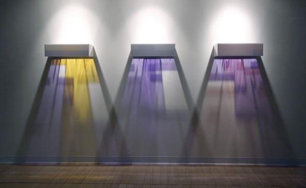 Won Ju Lim, "Kiss T2", 2005. www.arttattler.com/archivetakemethere 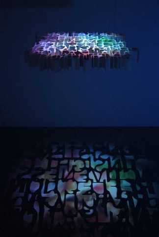 Shin-il Kim, "Duration to Intuition", 2008. www.saltworksgallery.com/shin-il-kim Shin-il Kim also uses multiple panels fixed to the wall to bring information out from the flat surface of the wall. Angles and corners keep recurring in my work and in my presentation of my prints, so perhaps this is another way that I can manipulate my existing work so that it is more ‘active’.  Shin-il Kim, (no title) www.koreaartistprize.org/en/project/kim-shinil This semester has seen my practice follow a lot of lines of enquiry, essentially to try and uncover what I want to pursue for a more resolved body of work. This has so far meant that a large volume of experimental pieces has been produced; mostly prints and small embossed pieces. With this in mind I want to expand this body of work further, and incorporating more elements into it so that it becomes more rounded. There are several new processes which I have only just scratched the surface of such as laser cutting. I really want to take this process further, firstly by making my own letterpress blocks that I can use both to print and emboss from. I would also like to see the potential possibilities of laser cutting layers that build up to create one solid 3D object. This would take a lot of planning but could prove to be really successful if it is thought through effectively. 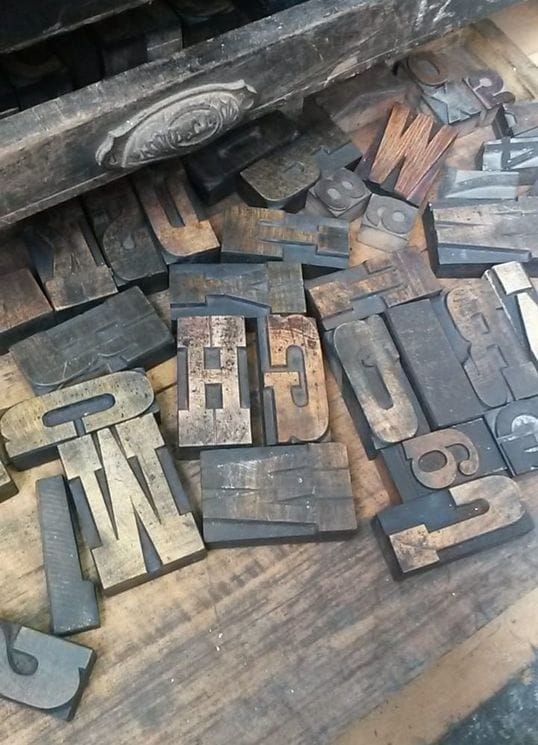 The sculptural theme continues with the idea of using a milling machine to create relief works. As it stands currently I feel that a lot of my work is relatively flat and I would love to pursue a way of working that crosses the boundaries between 2D and 3D. I would also like to incorporate this relief idea into the prints I am currently working on, to bring the image out from the flat surface that it sits on. This relief idea can also be stretched to my embossed pieces, which currently exist as small experiments. I would love to blow this idea up in scale and make really large embossed pieces that can either exist on their own or be incorporated with other processes, perhaps hanging a series of them in different lighting conditions could change how they are approached and perceived by the viewer. I have realised that I favour my work to be presented in a linear fashion (till roll, continuous line installation, the use of the printing roller), and so with these new embossed pieces I would like to expand further on the use of line in my work, combining line and the linear qualities of text.
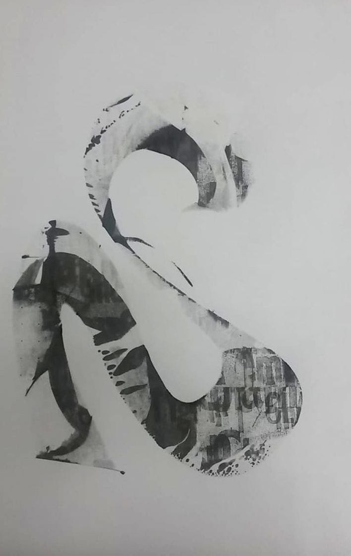
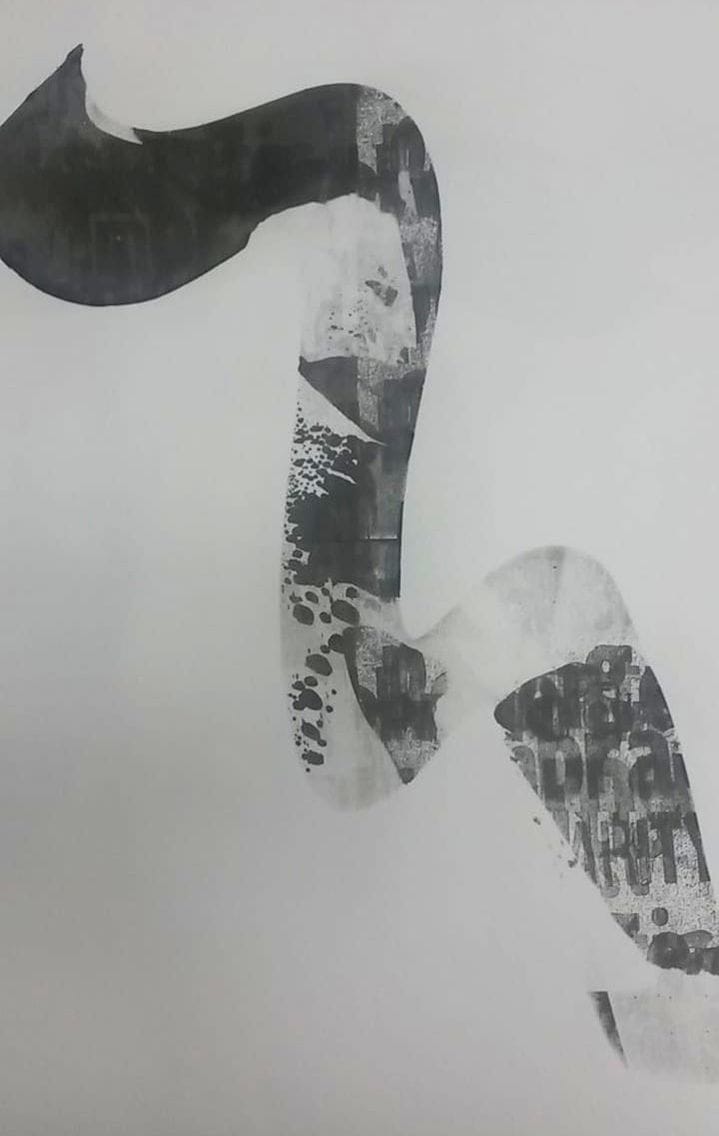
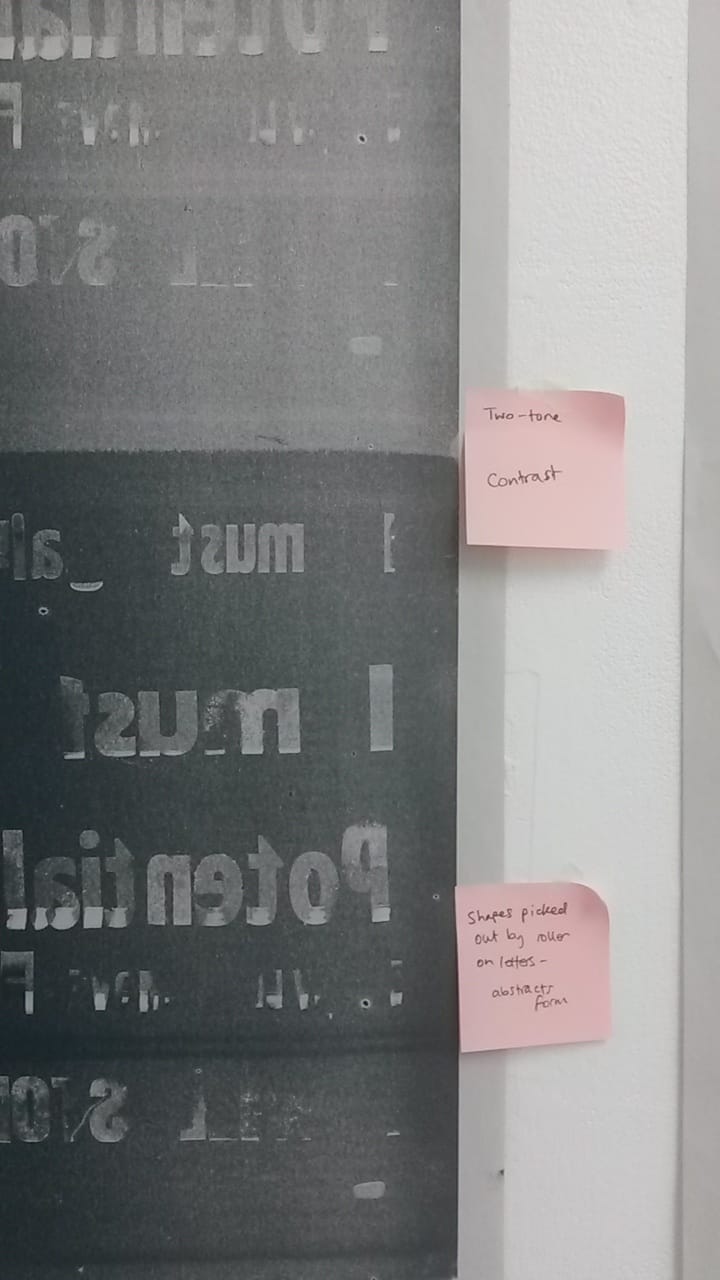
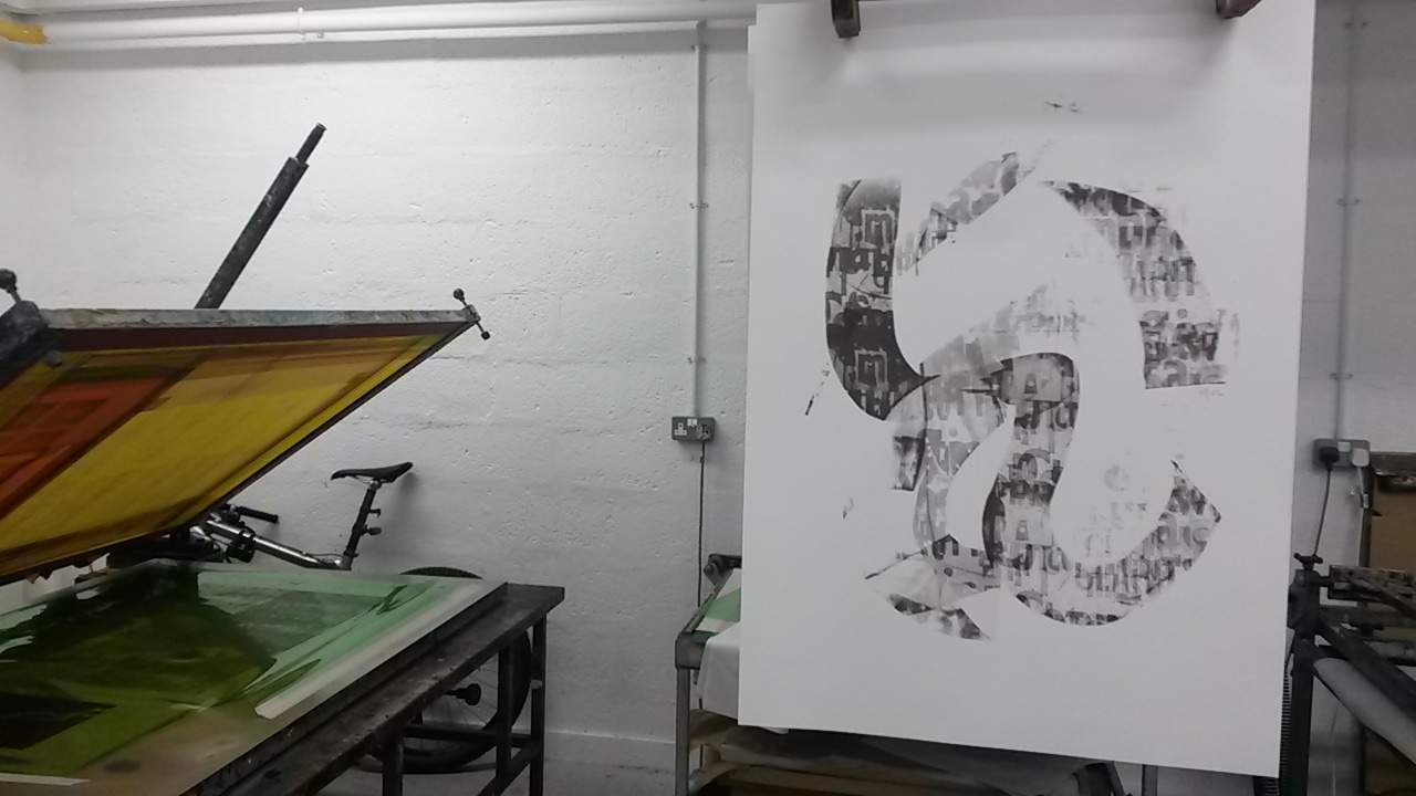
Looking back over my body of mono prints definitely helped refine the ideas for my screen print. I selected one of my roller prints on acetate and used this as a basis to work from. 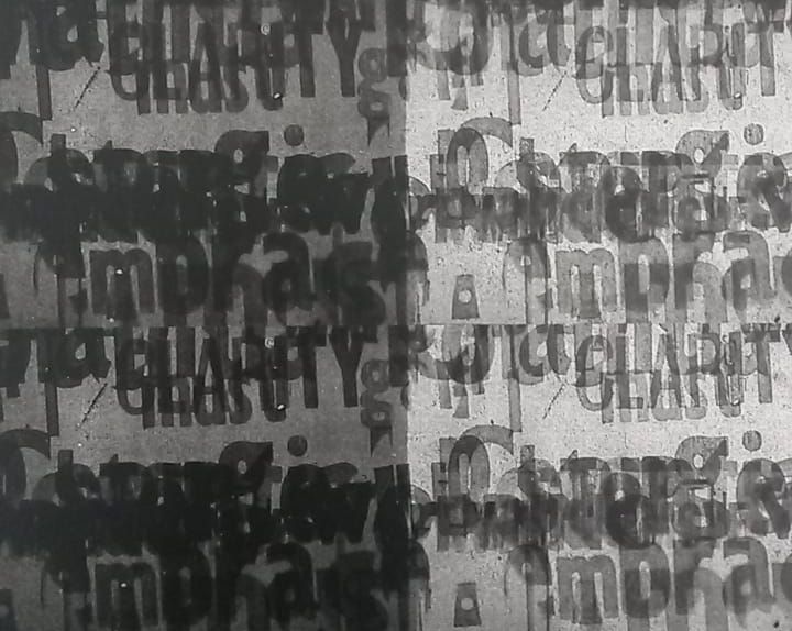 After editing a scanned version on Photoshop, an A2 sized image was made and exposed onto a screen. The prints were effective but were host to a number of problems. The original mono print that I used to create the exposed image spanned two different tones of ink, resulting in a two-toned image. When relayed onto the screen the darker panel on the left is too dark, the overlaid text is barely visible at all. There is also a clear line in the middle of the image from where two of the repeating images do not quite touch; drawing attention to the mistake with a dark line across the centre of the print. Also, for the purpose of testing the image, this print size is too small. 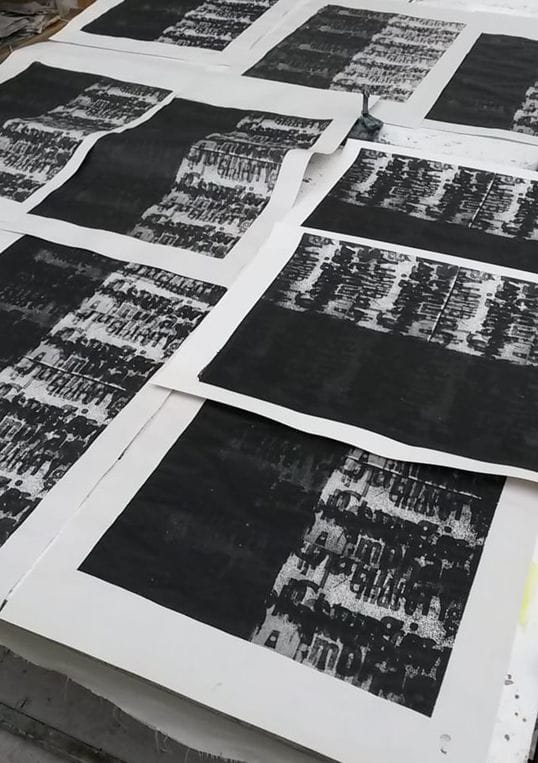 What proved more successful however was the use of a smaller squeegee on the screen to create freehand prints. The process of pulling the paint through the screen by hand means that each one is full of imperfections, unexpected tonal ranges and ink spots. Each one is unique and picks up traces of the print made before. And after a number have been made, a full print of the whole screen reveals another distorted image, including traces of all the previous prints. I would like to continue with this way of working with the intention of making a series of these types of prints. 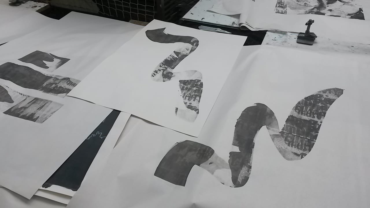
 After making the changes to the original image that I used I made a screen of double the size. I also made another image that consisted of just the letter forms that had been extracted from their background, to use as another layer over the top of the larger screen. The resulting printed image is much clearer, although I am still undecided if the darker panel on the right has now been lightened too much. What does help this is the extra layer of the letters printed over the top of the original ones which emphasises them against the background. 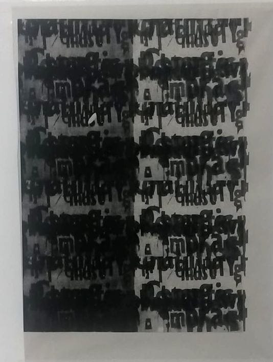 I am also undecided about the composition. There is the possibility of splitting the image and turning it into a diptych, the two separate panels related but not touching- perhaps giving more room for each side of the image to breathe. 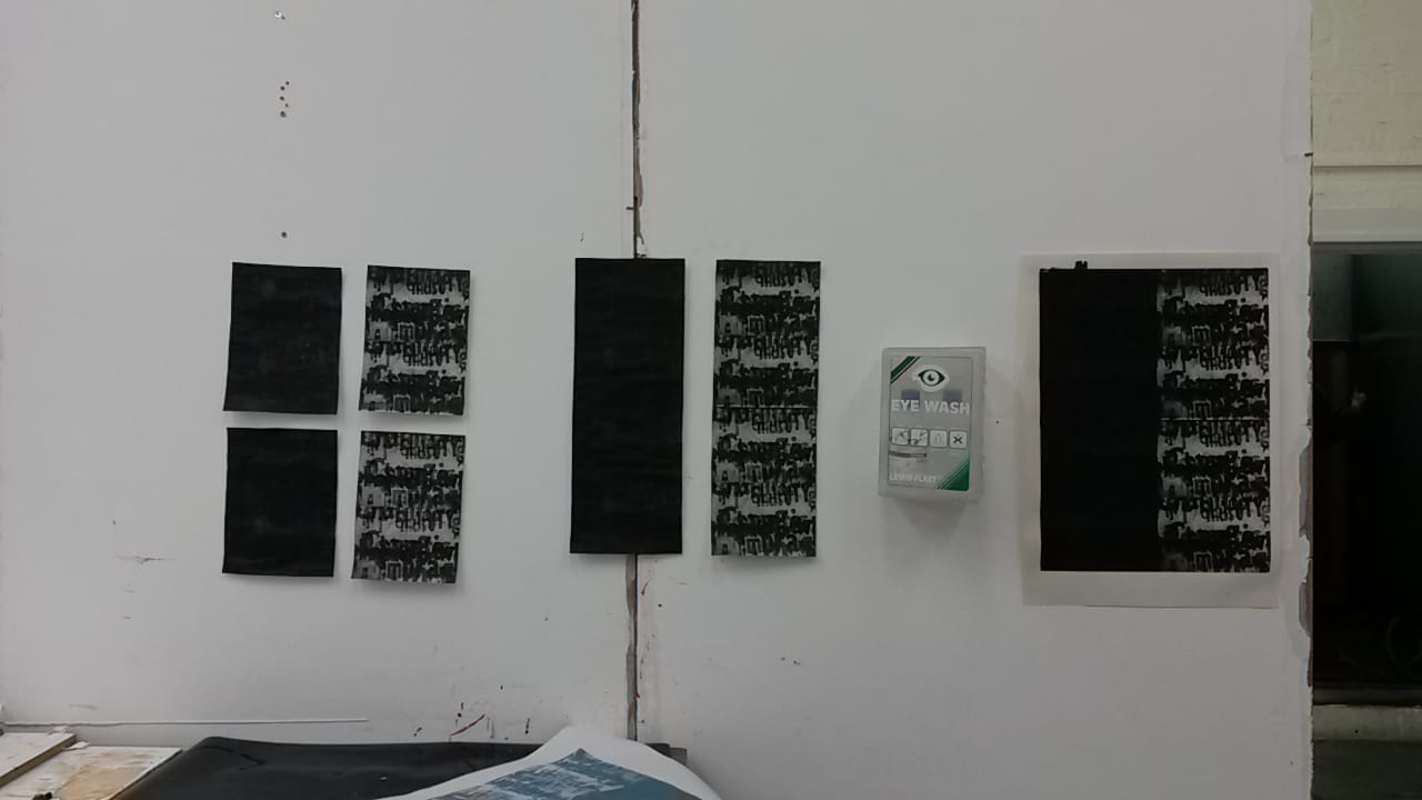 Although these prints remain as works in progress there is lots of potential that can still be developed to eventually resolve them.
Since I have been working on my larger scale roller prints I have found it difficult to make progress, so I have gone through an editing and evaluation process to pick out the things that I believe have been successful so far with the prints, and where to go next. I am hoping that this process will help to refine my ideas for a large scale screen print. 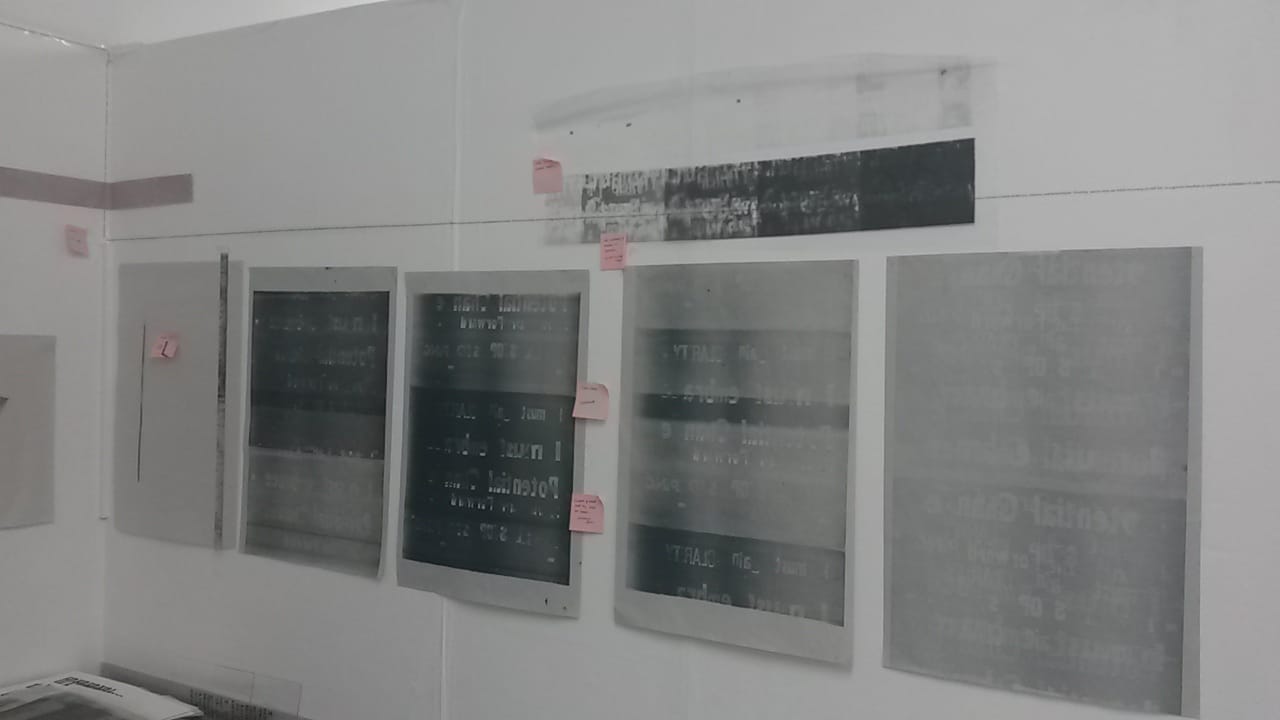
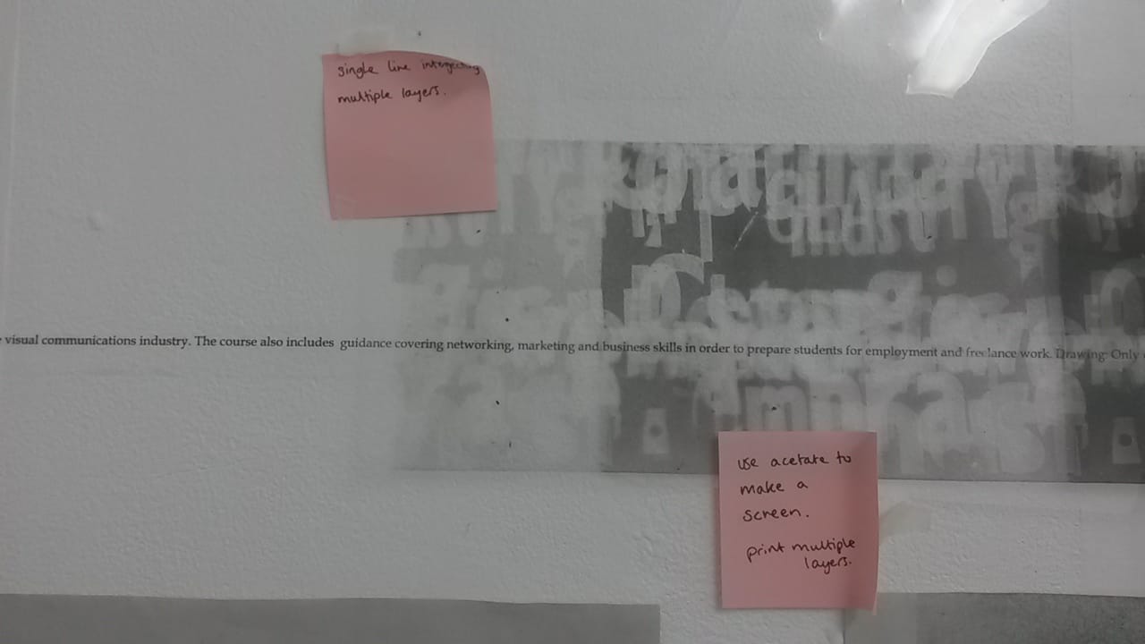 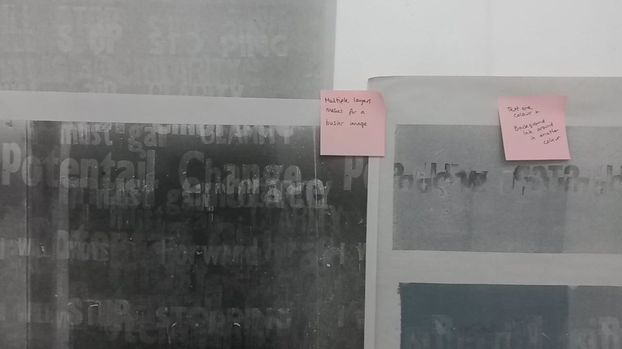
 MULTIPLE LAYERS MAKE FOR A BUSIER IMAGE
LAYERING PAPER UNDERNEATH PRINT SO THAT OUTLINES SHOW THROUGH CUT OUT LETTERS TO GIVE OUTLINE UNDERNEATH PRINT TEXT ONE COLOUR AND BACKGROUND INK ANOTHER COLOUR TOO LINEAR? EXPAND BEYOND ONE LINE CORNERS. 90° ANGLES ENLARGE THIS! OCCUPY A WHOLE WALL USE ACETATE TO MAKE A SCREEN. PRINT MULTIPLE LAYERS TWO-TONE CONTRAST SINGLE LINE INTERGECTING MULTIPLE LAYERS SHAPES PICKED OUT BY ROLLER ON LETTERS- ABSTRACTS FORM The work of Idris Khan had been mentioned to me before by artist Hew Locke but it wasn’t until my trip to the Whitworth Gallery in Manchester that I have been able to see it in the flesh. Khan draws inspiration from history philosophy and theology, layering and manipulating images and texts to produce single outcomes. His layered ink stamp pieces span whole walls, with hundreds of individually stamped lines of text in several languages repeated over and over to create one shape that gives the impression of being on the borderline between two and three dimensions. He has also created similar pieces on sheets of glass that help to give this 3D appearance with the addition of shadows from the letters on the wall behind the work. This work is extremely relevant as I am in the process of trying to refine some layered text prints to then develop on a larger scale with the hope that it can create something as coherent as these stamp works. 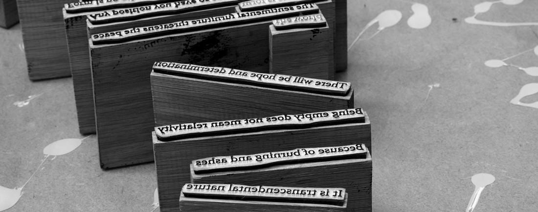 Idris Khan, Stamps used in his site specific installation in the Whitworth Gallery, 2016. www.whitworth.manchester.ac.uk/whats-on/exhibitions/upcomingexhibitions/idriskhan/
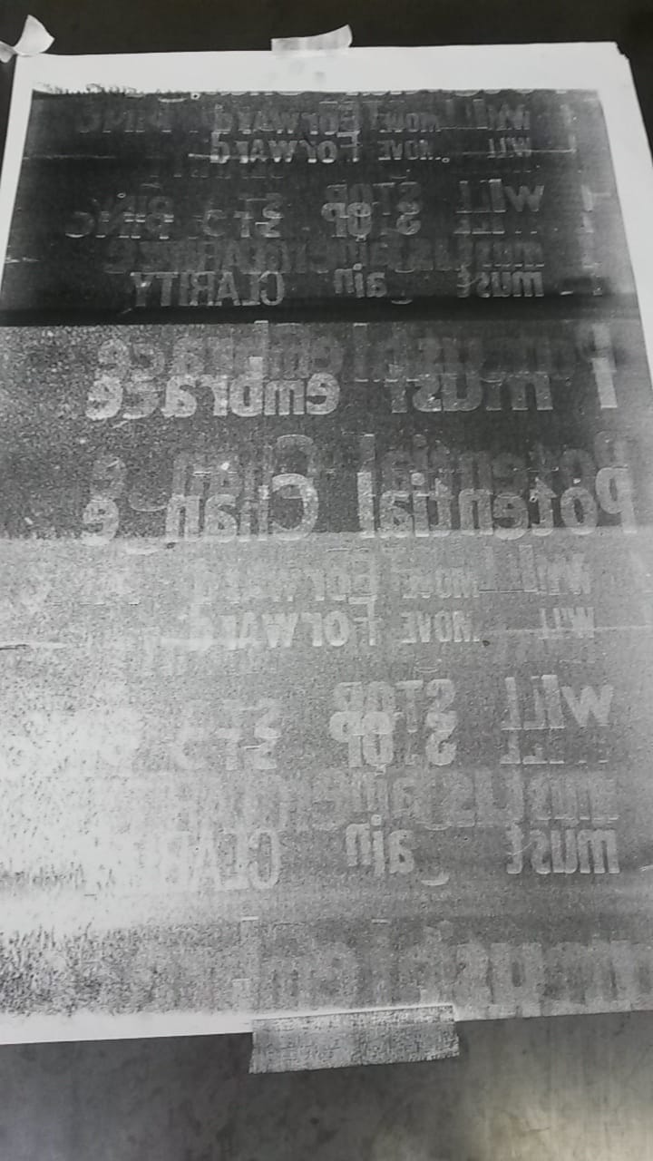
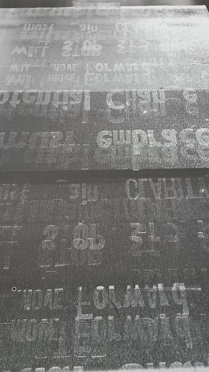
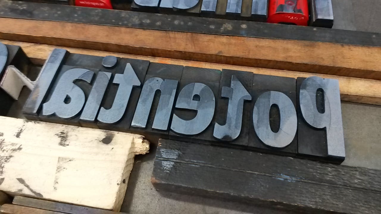
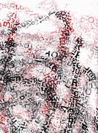
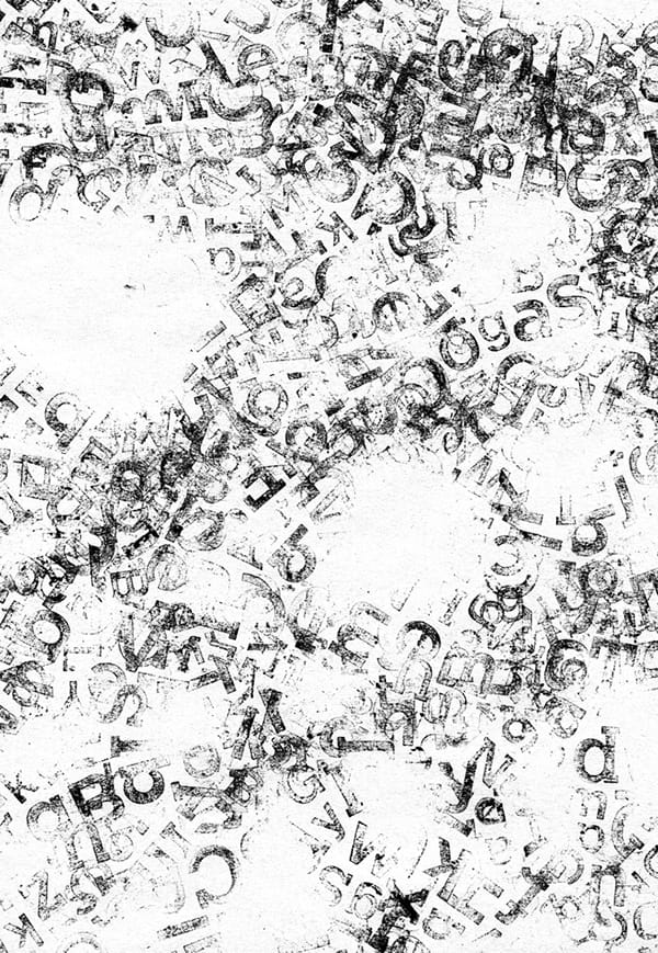
 Idris Khan, "Glass Wall Piece #2", 2015. www.skny.com/artists/idris-khan 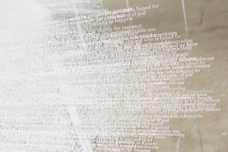 Idris Khan, Detail of stamped glass piece. www.skny.com/artists/idris-khan Following on from my initial use of a roller in combination with letterpress to create mono prints, I have taken this one step further by bypassing making direct prints from the letterpress blocks and using them as a means to make larger roller mono prints. Taking another of my manifestos to work with, I tried printing with just a single roll of the roller over the letters as well as printing when the roller has been across the letters multiple times to pick up the shapes of the letters more than once. When you roll over the letters once the print makes it easy to identify discrepancies where a letter has been missed or is not fully reproduced on the roller, however the shapes that are made are interesting motifs that could stand alone as a form of “anti-text”. Multiple uses of the roller over the same letters produce a far busier and less linear result with several versions of the statement overlapping. 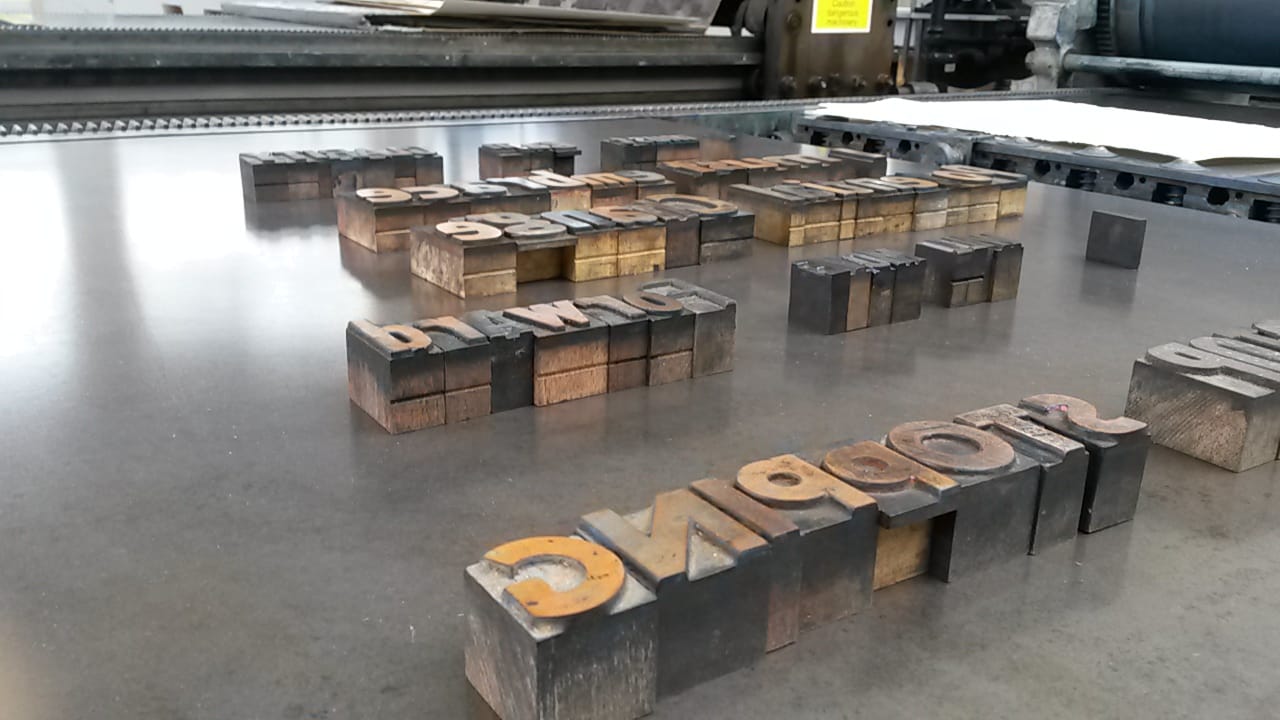 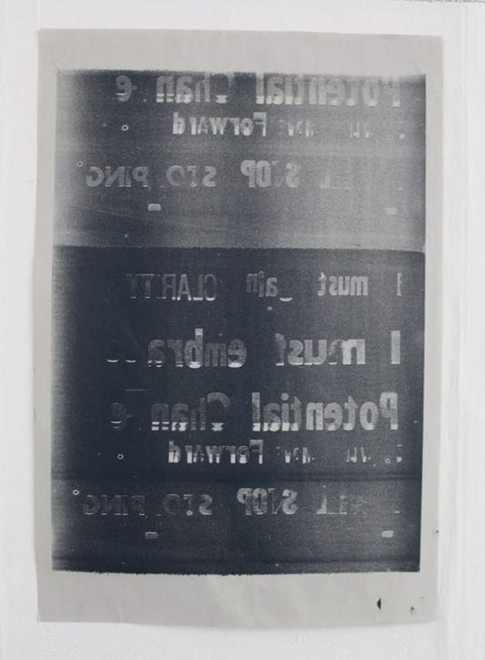
The process also produced an extra print on the letters themselves, showing a slight off-set from the original letters.
To try and get the resulting printed text the right way round I also tried first rolling the ink onto aluminium and then taking the print from there, The result is effective, however this does make the print hazy with more imperfections from the sheet of metal, there are too may degrees of separation from the letterpress blocks here. 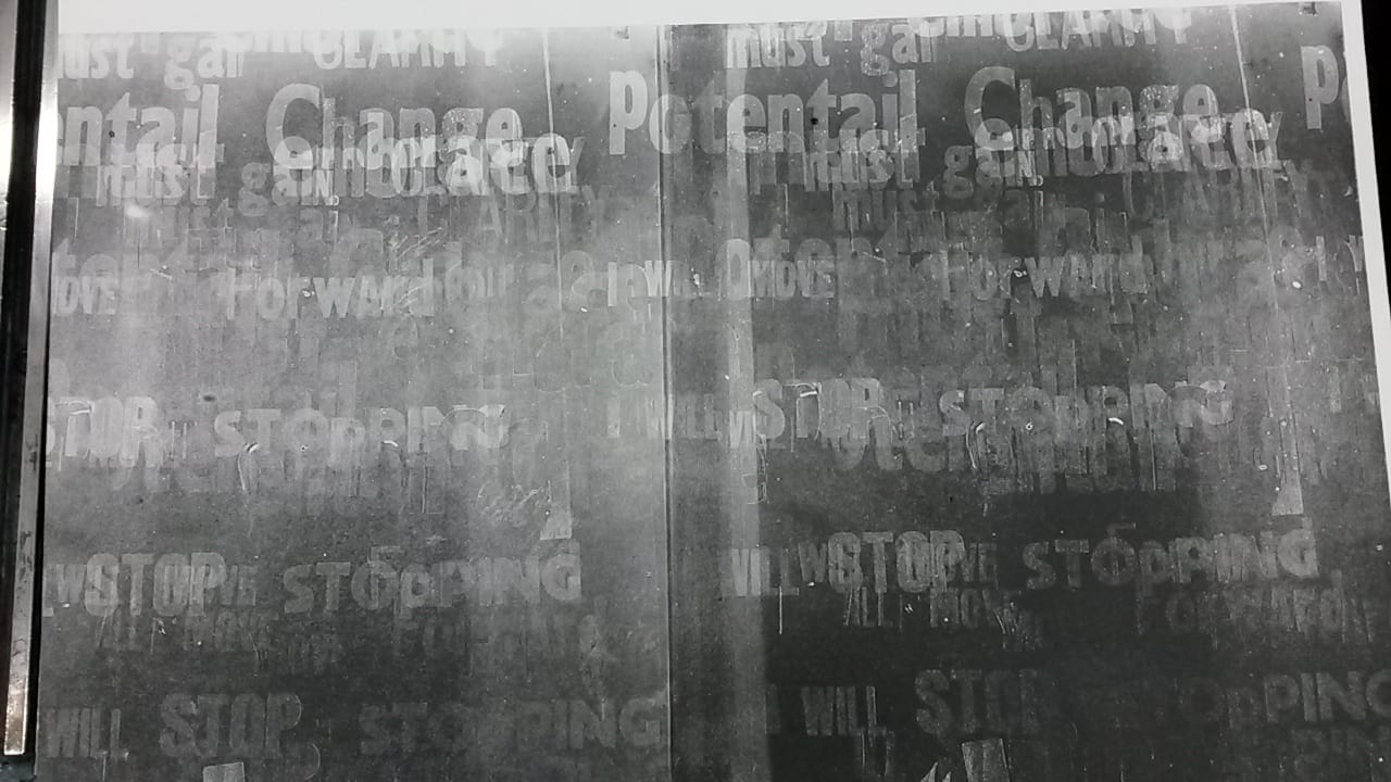 What proved slightly more successful was printing from the roller directly onto acetate, giving the same level of crispness of the print whilst allowing the letters to be seen the right way round through the clear plastic. Whilst the direct prints have their own charm I think that the future of this work will be through screen print once I have successful roller prints on acetate, as I can edit the imagery and use the more stable printing process to create layers. Once this has been created I could go on to use other processes on top. 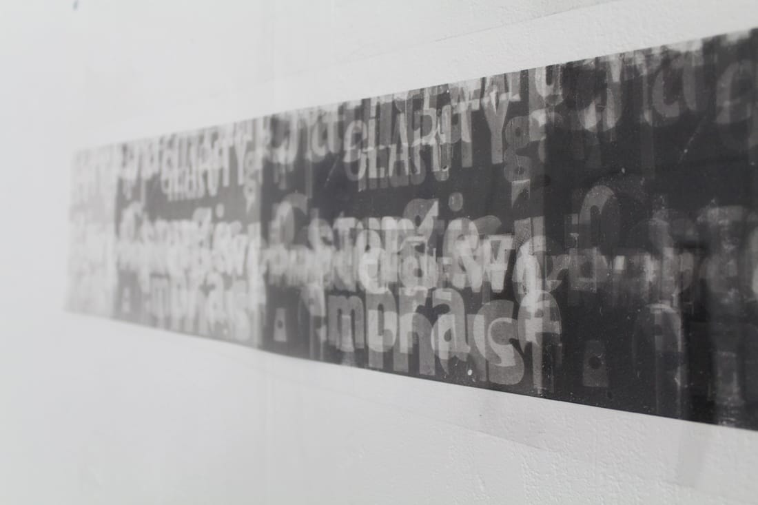 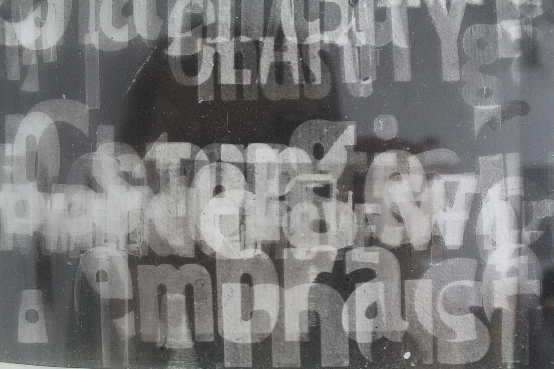 Hew Locke is Falmouth University’s new visiting professor of Fine Art. After graduating from Falmouth in the 80s Locke has been working as a sculptor and installation artist and has shown his work nationally and internationally. In particular I have found his wall pieces the most inspiring, taking inspiration from banners and flags, Locke glues objects onto the wall to create his own coat of arms. The cord and beads that are used to outline the historic figures and strange creatures are left hanging down, giving the appearance of a worn out piece of tapestry; left as a visible que to the works’ historical contexts. 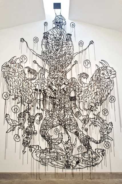 Hew Locke, "Sin Eater", 2008. www.hewlocke.net 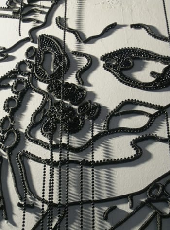 Hew Locke, "Sea Power" (detail), 2014. www.hewlocke.net In a 1-1 discussion with Locke we discussed the difficulties in finding a context for my work and how to work around it. It was clear that the work that I have been making up until now looks very design orientated, even though that is far from its intention. What was highlighted in my work was my installation piece using a single line of text to occupy a space, which I should continue to develop and if possible, to find a company that can print vinyl lettering so that the appearance is a little sharper. I could then use this single line to bring together a number of other works, seeing as my current practice is so eclectic. We also discussed my roller mono prints. Locke agreed that a larger roller should be used, and to treat the process like a painting and take the process as far as it can, with the potential to print onto fabric with other additions made using other printing techniques, and then stretch it onto a frame. Even if these prints aren’t successful, I want to make them to be able to clear my head space.
Whilst making letterpress prints I made an accidental discovery of a process that produces unique and unpredictable prints using the printing roller. Rolling ink over the letter blocks leaves a negative image behind on the roller, and when the remaining ink from the roller is rolled out onto paper the resulting mono print is a linear matrix of the initial letters. 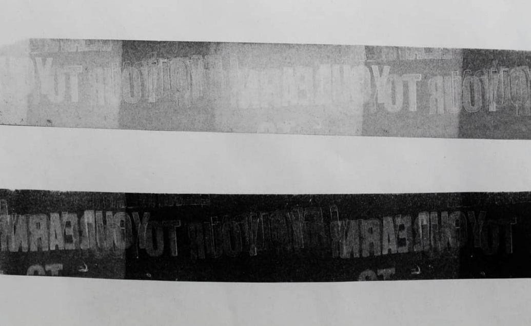 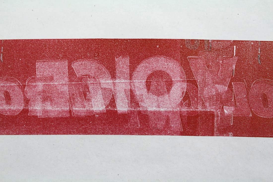 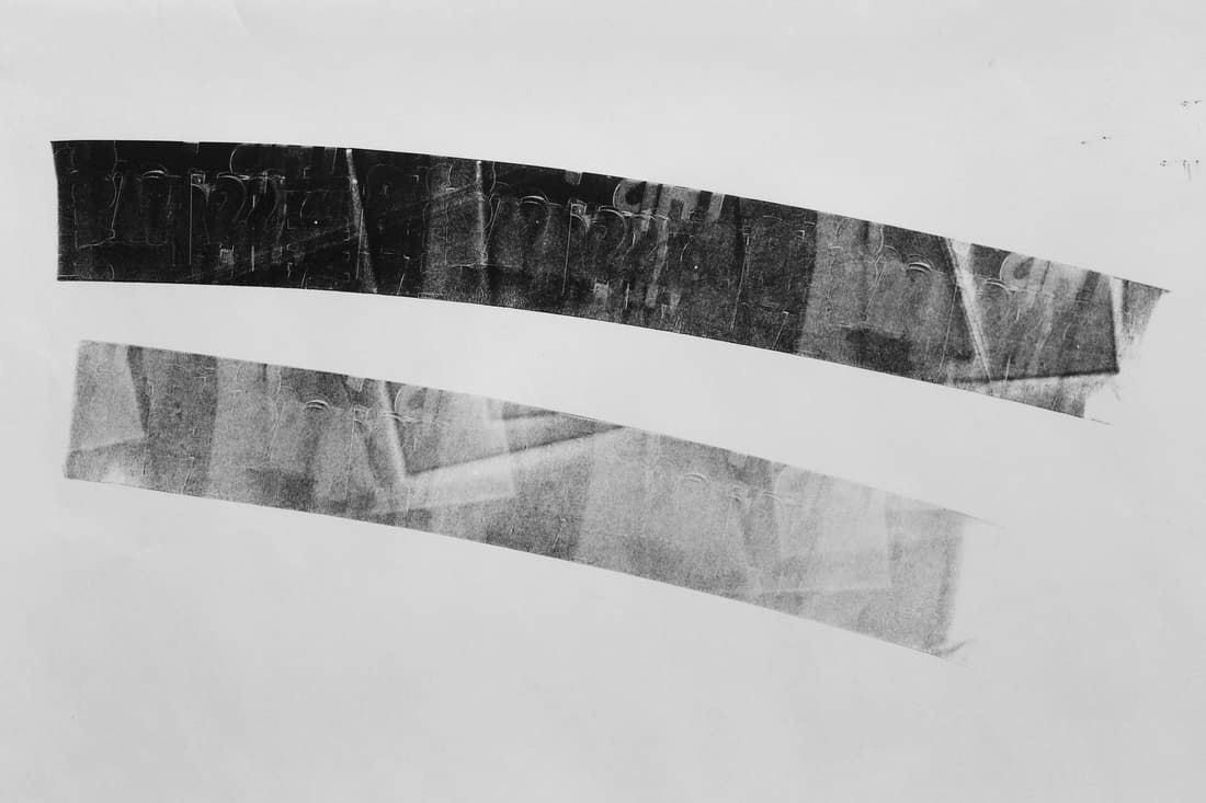 If one colour is already on the letters when you roll over them with a different colour, the negative spaces become positives in the resulting two-tone print. 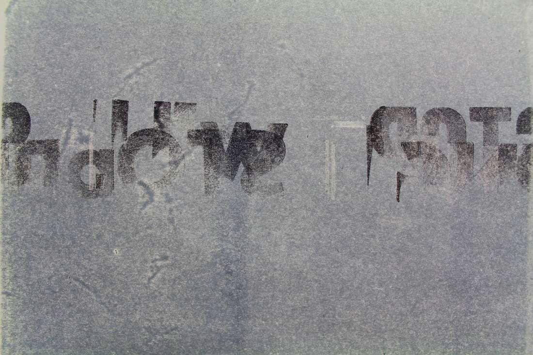 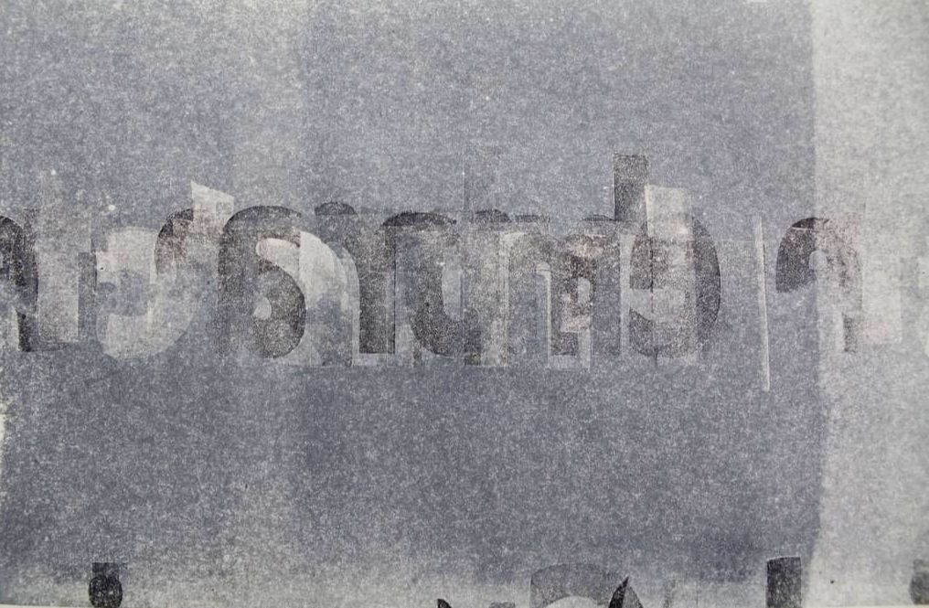 This process is one similar to that of Eric Calderon’s “Typography Sphere”. Described as an “artist book”, Calderon’s sphere demonstrates how a process can be as much of a piece of artwork as the outcome. Calderon describes; “An artist's book. A book as an artwork, an artwork as a book. Inspired by the arts and craft movement as well as the Bauhaus functionalism, I created my own kind of art tool. The painter has his brush, the carpenter his hammer, I have my typographic ball. A book that writes itself. A piece in constant change.” The sphere is adorned with a number of cut out letters, that when inked up produce a matrix of overlapping lines with different combinations of the letters. The sphere itself is in essence the source material from which an infinite number of outcomes can be produced; no two prints from the sphere are ever the same. The more that the ball is rolled the more dense the resulting image. More layers of ink muddy the image, and the text becomes more difficult to read. No story or grammatical sentence is spelled out on the ball in the first place, therefore any words or structures that appear are coincidental. 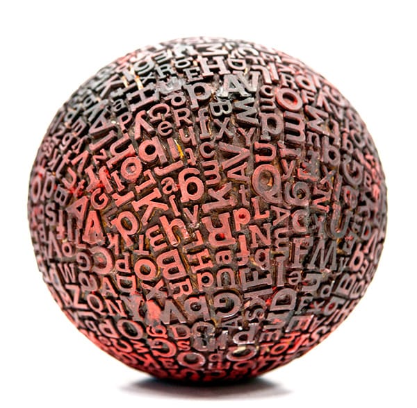 Eric Calderon, "Typographic Sphere". www.behance.net
I find that these types of mono print are more interesting than original letterpress prints, as they are more in keeping with my aims of disrupting the reading process. I would like to take the kinetic process further with more rolled prints. Their unpredictable nature however makes it difficult to be sure if any one print will be very visible, or that all of the letters have been included. The nature of the roller also means that the line that is produced is split into blocks of decreasing levels of ink. Initially I have only used rollers with a small width so that they roll over the desired letters on the printing bed, but if I were to pursue this process any further I would like to see how a larger roller would work.
|