|
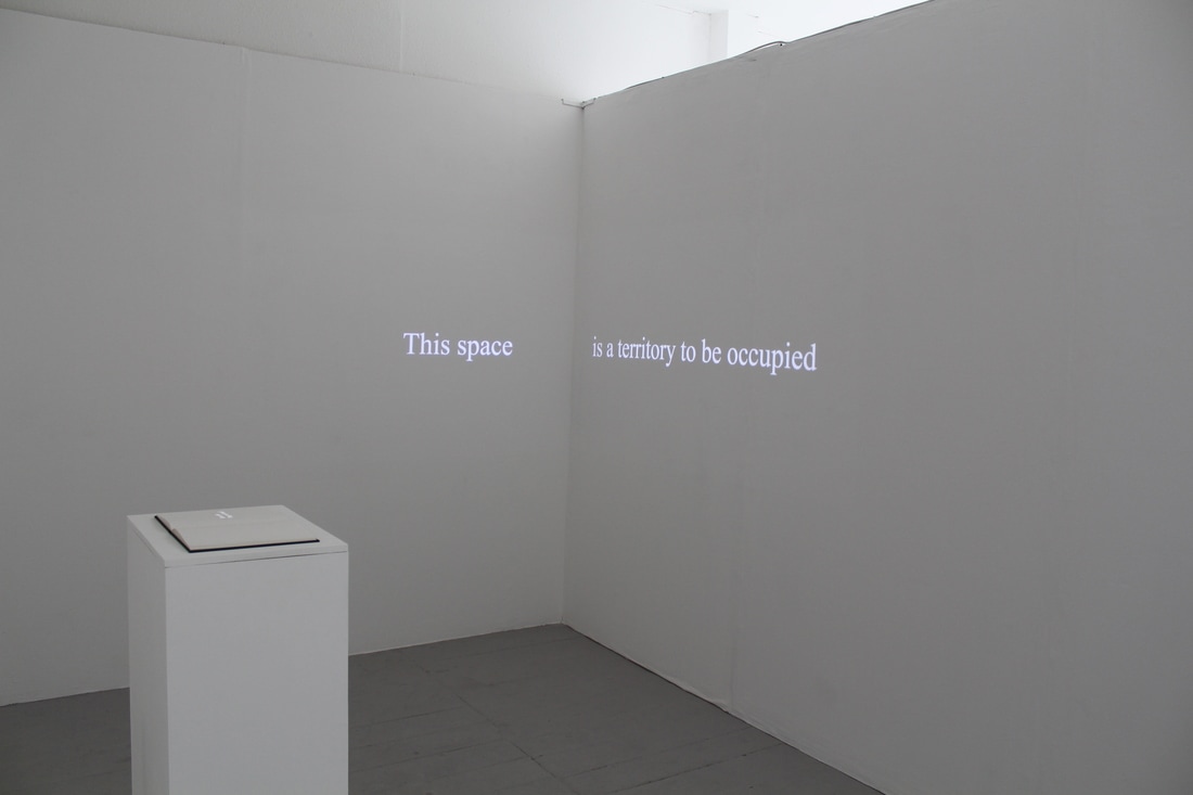
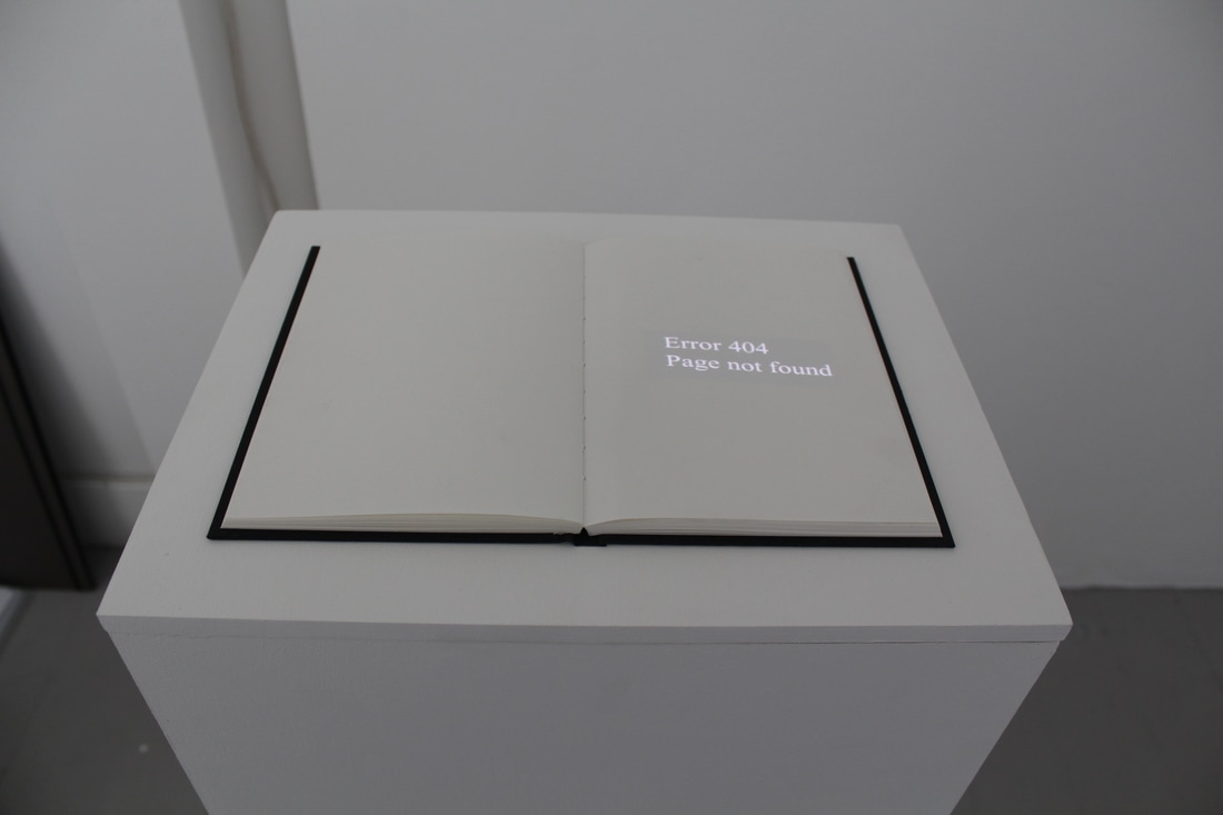
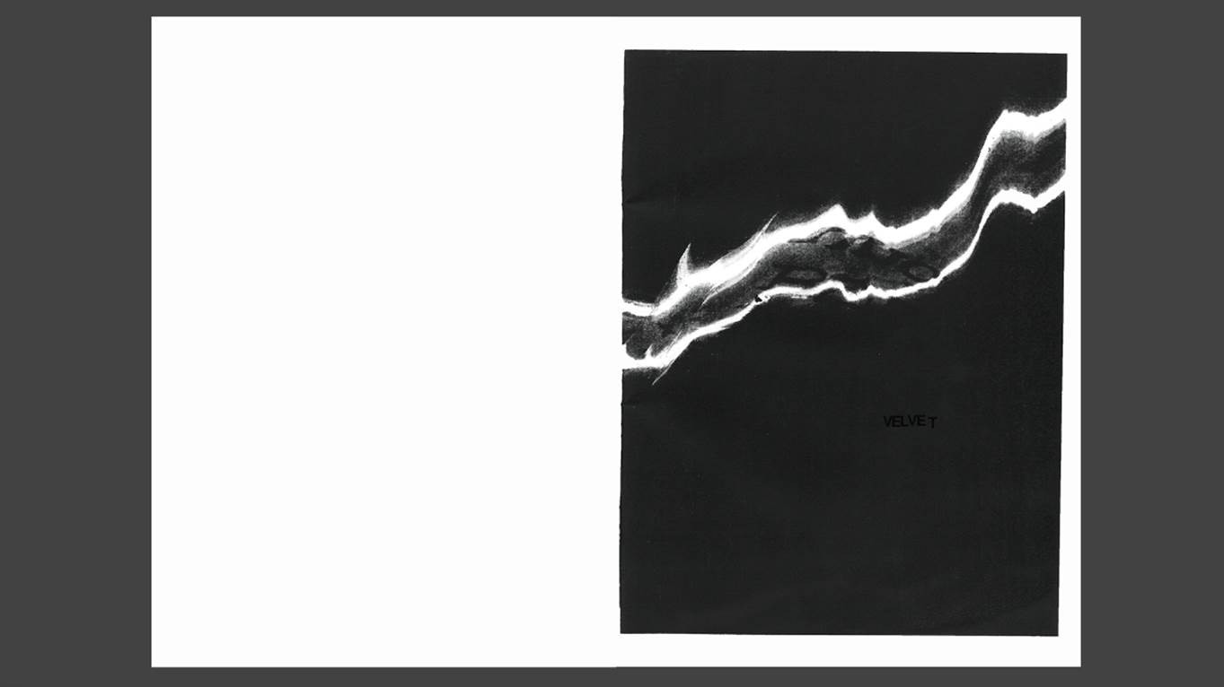
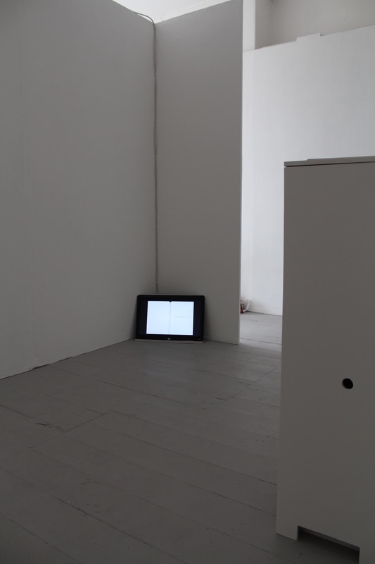
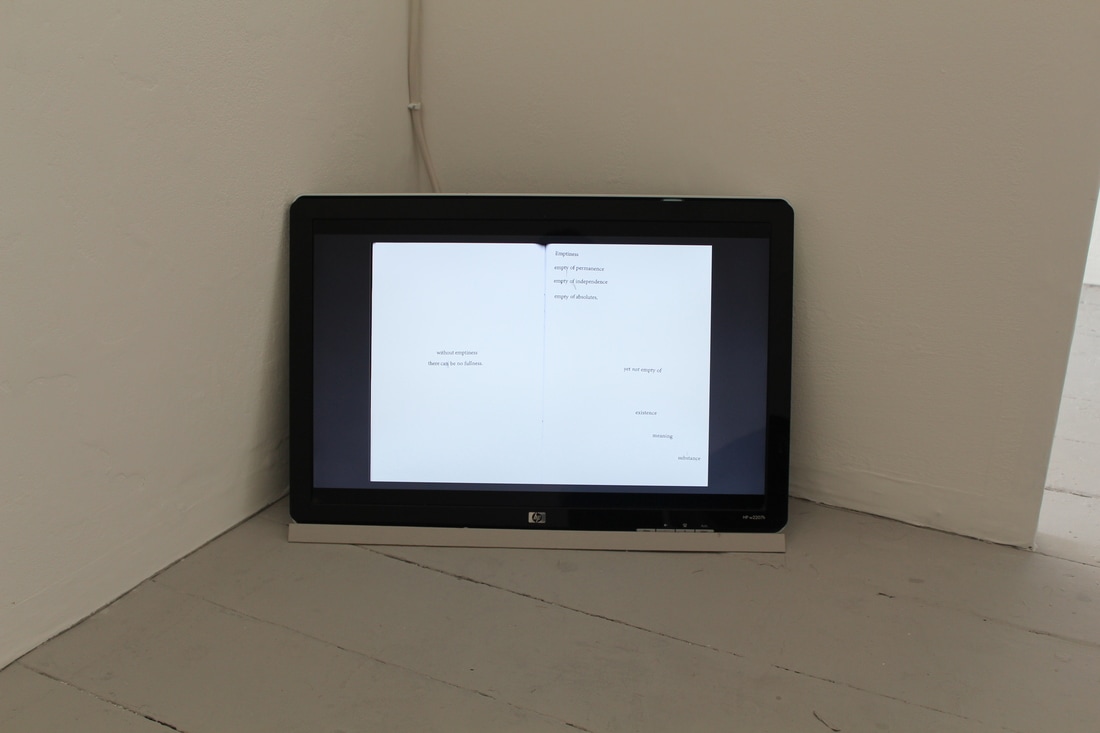
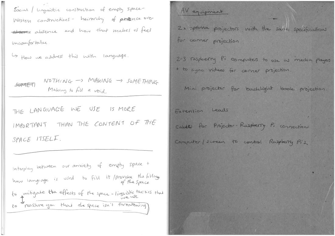
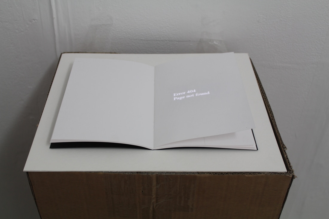
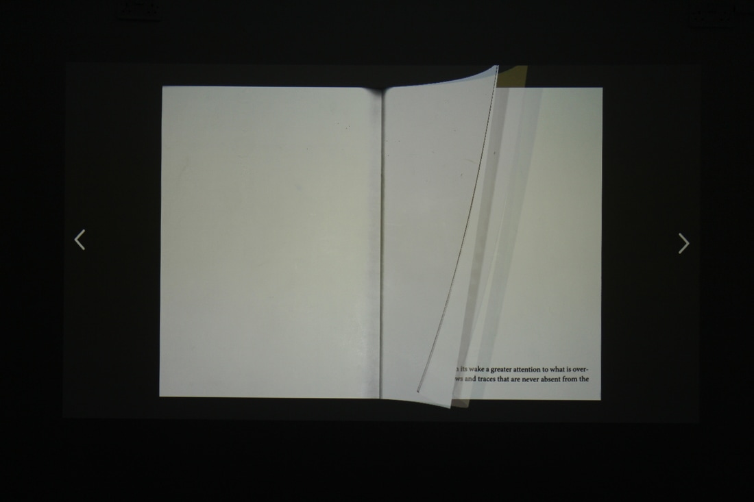
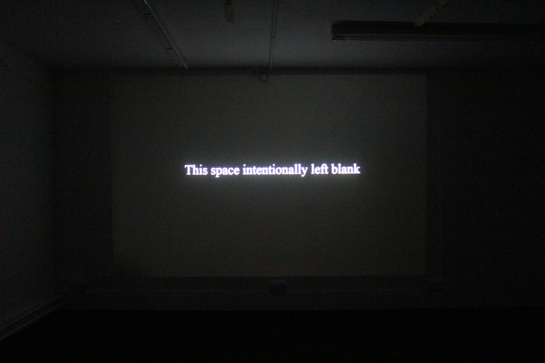
Although I have planned a lot in advance for the setup of my degree show space, the real work could only happen once I was assigned my space. I was certain that Error 404 would be present in the show, as well as my projection piece that would occupy the walls. These two pieces were set up first. As you enter the room, the corner projection is occupies the walls of the furthest corner, that faces you. It is a direct confrontation to audience members. What I like about the piece however is that between each ‘chapter’ of the animation there is a fade to black, which doesn’t appear on the wall, so it could be some seconds before anything appears, leaving the audience members to wonder why the space might be blank. The interest is then drawn to Error 404, which sits on a plinth to the left of the space. It is not directly in front of the corner projection, but occupies enough of the space close to it to not go unnoticed. The error message remains flickering at all times; there is a moment where you notice the flickering out of the corner of your eye- which I hope would encourage the need to move closer to inspect it. As the viewer turns to view the work on the plinth, there is a shift in movement, in the direction that the body is facing; the back is turned to one piece as it directly addresses the other. What was also unintentional, yet quite ironic, was in the process of turning to address the work on the plinth, the space behind it is a blank wall. I have been told that the plinth harks to a lectern where presentations are made, and so perhaps the reader can now go about presenting their findings to a blank wall. After these two pieces were decided I was however uncertain as to how my zine work would appear (if at all) in the space. I wanted to be able to give some idea about the working process that had gone into making the work, whilst remaining with the form of an open book. After looking at the other two pieces in situ it became clear that if anything else were to be shown that it should follow suit in their clean, minimal appearance. The zines that I have made appear online, to be viewed on screen, and so I hoped to try and replicate this viewing experience by making my zine appear on a small monitor screen. At first I had it so that the pages would turn, like they do online, but when looking at it in comparison to the other two works, that would only fade or flicker with minimal transitions, I decided that a more subtle transition would suit the book pages; the turning is not needed to hint at its form as a book, as the scans of the pages already reveal the images origins. The video now clicks between each slide, giving 10 seconds to view the page before moving on. The screen could contain any number of slides from my collection of sketchbooks including my print based work which had so far not made any kind of appearance in the show. However when viewing the print work on screen I found that it was too much compared to the other work, so I paired it back to show the pages in direct relation to the themes of emptiness, and he need to fill space, whilst not overlapping with some of the book pages that are displayed as part of my corner projection piece. After first thinking that the screen could be displayed on the wall at eye-height (an easy reading view), I decided on keeping the monitor low down, resting on the floor. It gives the space a circular sense of movement in that the audience’s attention moves from eye-height, to looking down at the plinth, to then looking down further to the screen. It also hints to a discarded view of notebooks which aren’t often displayed, either discarded or kept hidden. I have displayed the monitor in the corner closest to the audience as they enter the space, so it is at first not noticed. It is only when you enter into the space that the work can be seen, and only properly viewed when you turn and crouch down. Again, the minimal flicking between pages might draw interest out of the corner of the eye before any further engagement takes place with the work.
0 Comments
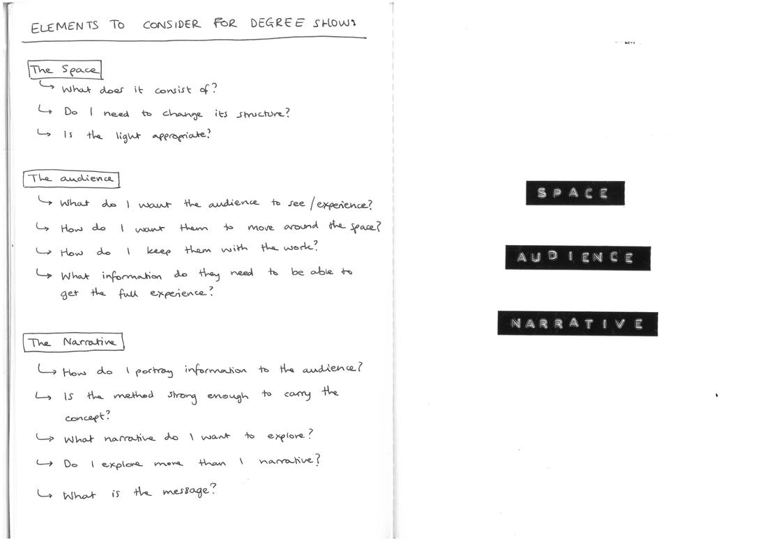
In the run up to my final degree show I have been making considerations for the display of my work. For me, the audience and their experiences are paramount, and so I am specifically paying attention to how my work will directly address and involve audience members. I plan on having a number of works on display for the show, each displaying a kind of solution to the "problem" that an empty space poses, using language as a tool to mitigate the anxiety associated with unoccupied spaces. A projection will occupy two of the walls in my space, wrapping around the corner of the space so that it mirrors the layout of an open book. The two walls will converse with each other using text and imagery. I will display Error 404 as a back-lit projection on a plinth. The 3D structure will break up the floor space and give something for the audience to move around. I hope that I will also be able to display my zine works, either in their digital formats or as a physical copy that visitors can take away with them. What this will depend on is the space that I'm assigned for the show and the overall aesthetic of the display. A lot of my work considers opposites, positive/negative, black/white, full/empty, presence/absence. To visually represent this I want to create works in the dyptych format to represent the two opposing terms, and to experiment with the idea of the "gap" or "grey area" that might exist between the two.
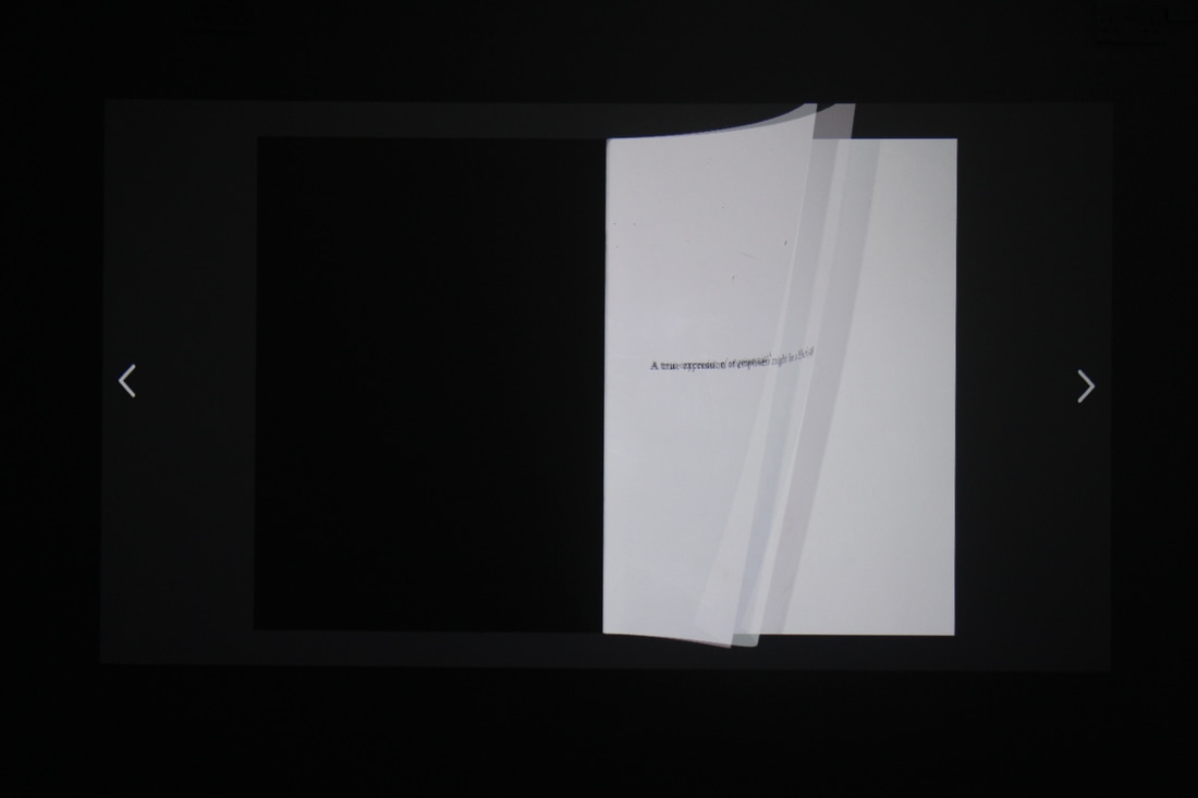
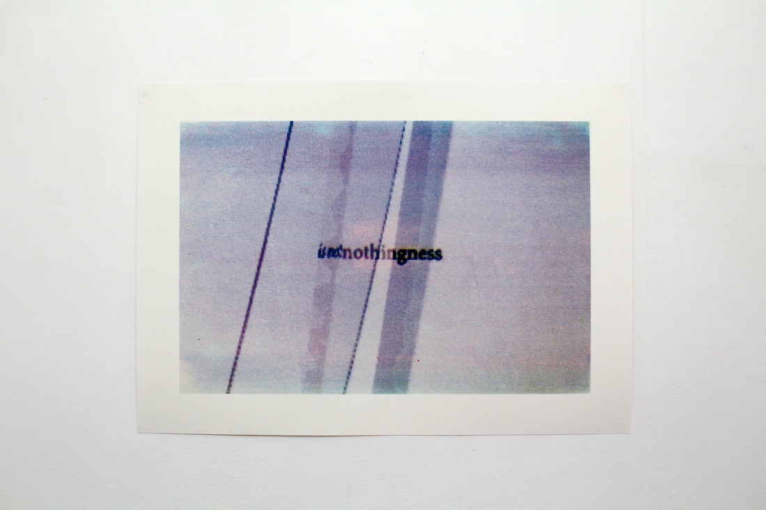
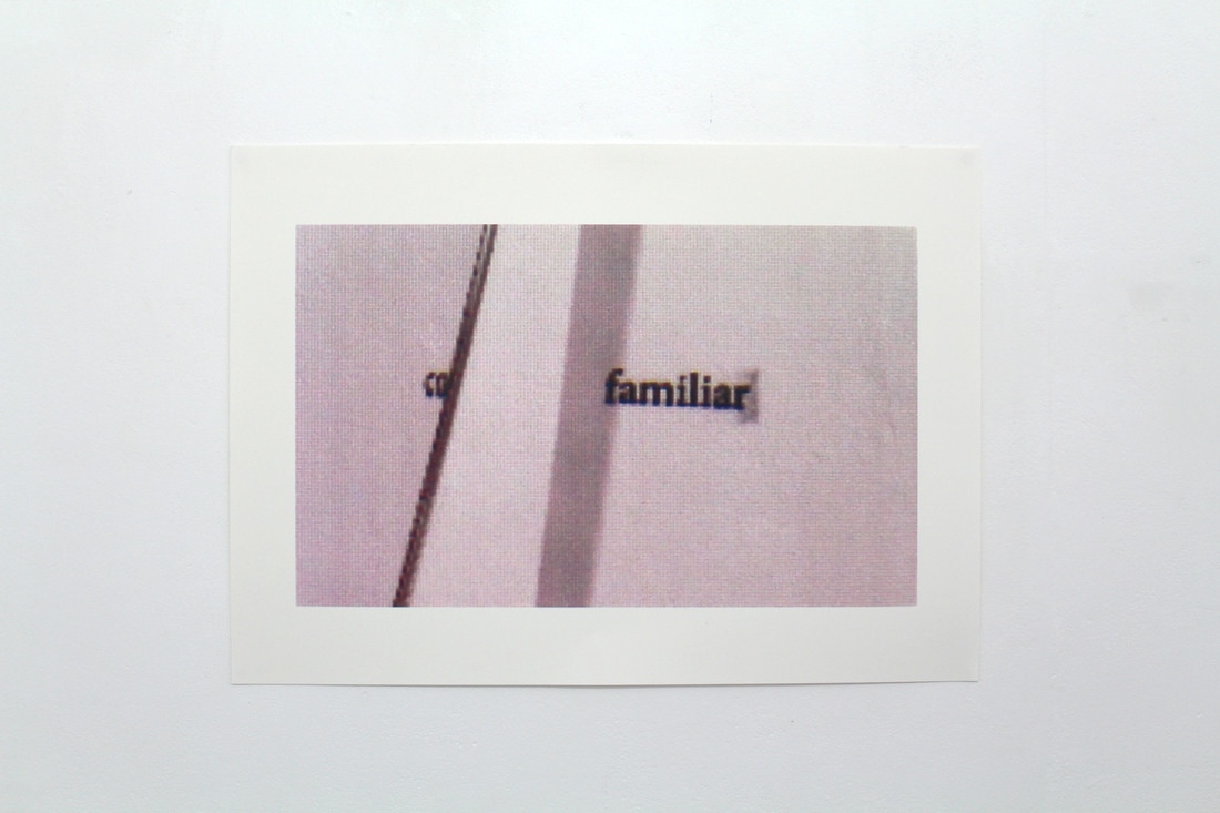
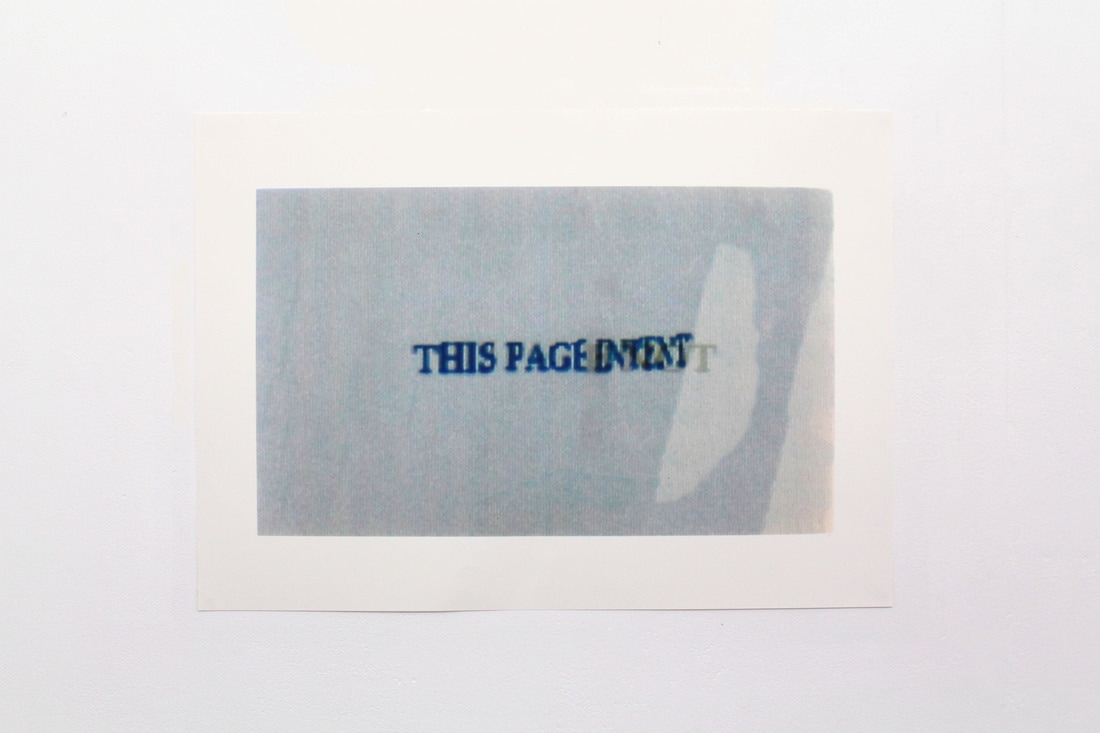
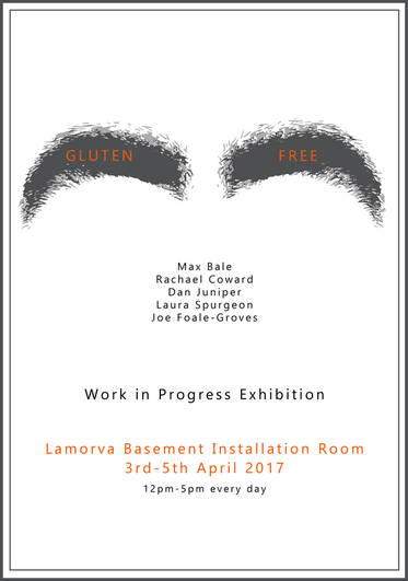
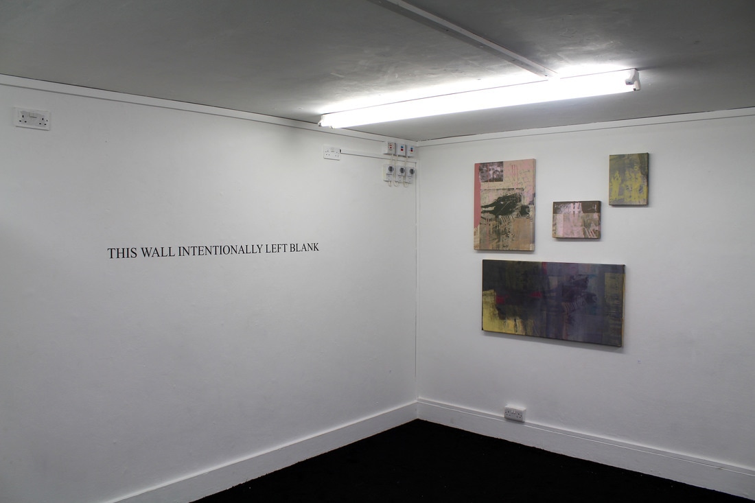
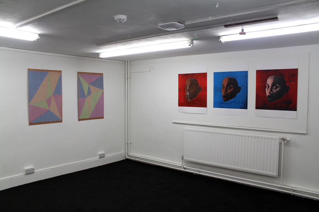
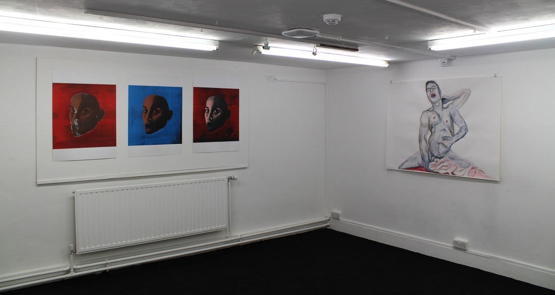
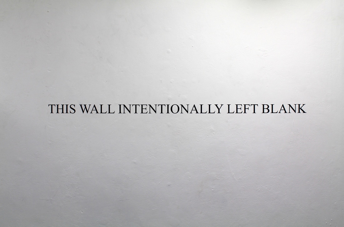
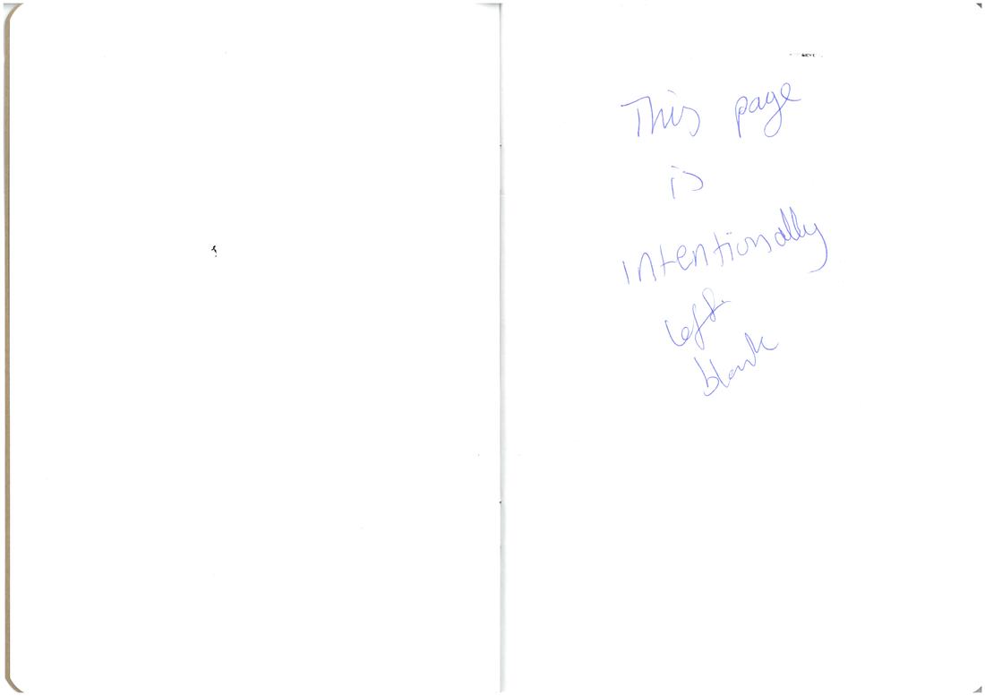
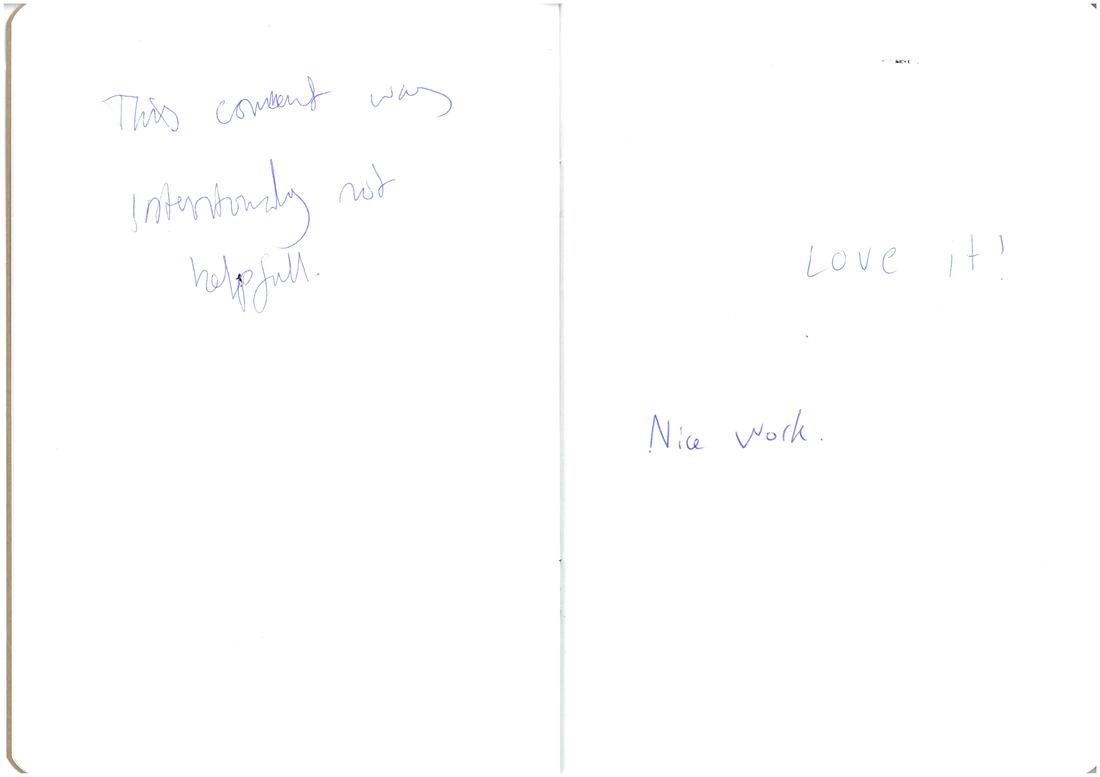
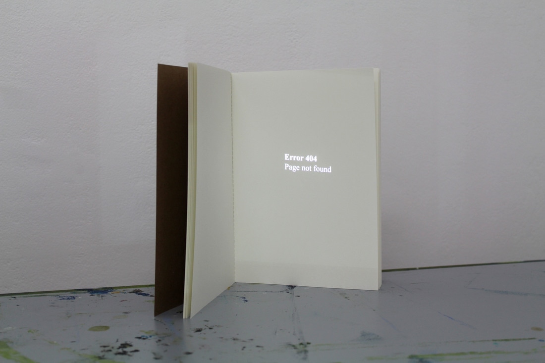
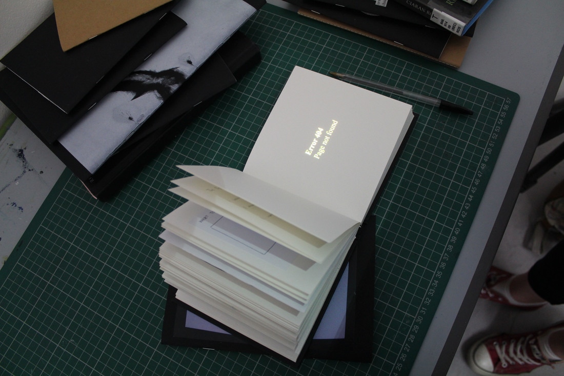
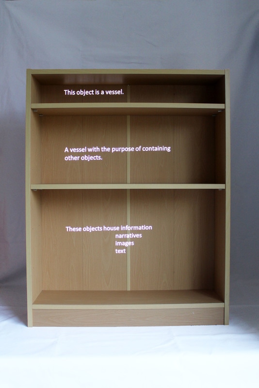
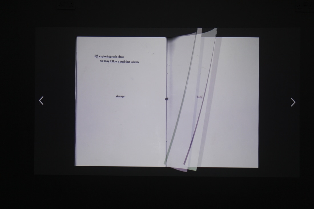
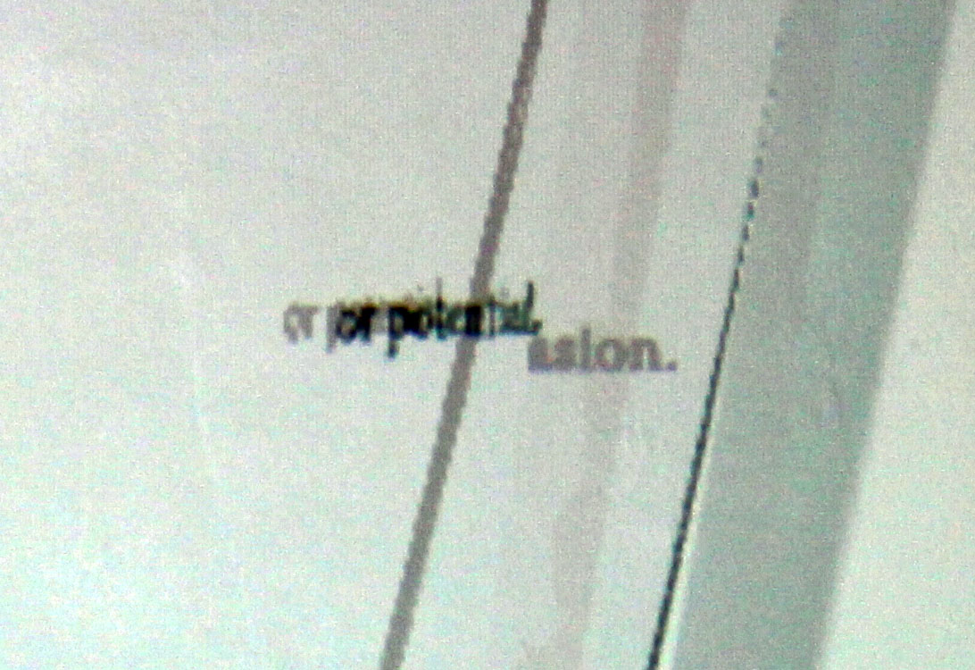
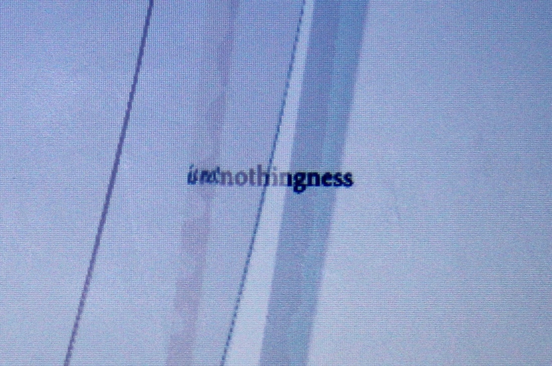
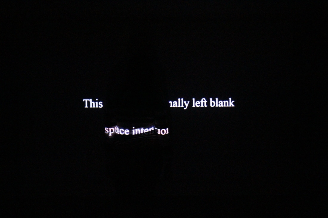
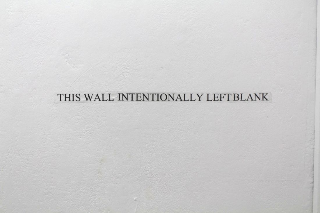
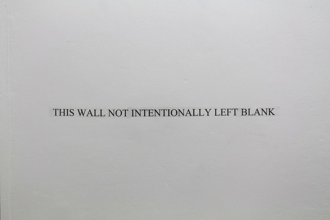
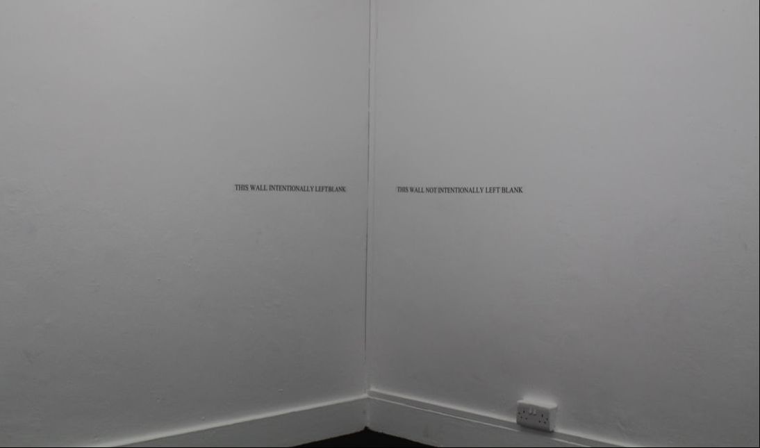
One way that I want to try and visualise this is by making a projection piece where two projectors are used side-by-side that have a conversation with one another, and by having the two screens playing off against one another the hope is that it could animate the space. I hope that the piece will also address the binary opposition of full and empty space which is in fact a false dichotomy, and attempts to follow Derrida in the hope of deconstructing the hierarchy that gives priority to an occupied space as opposed to an empty one. These prints are a series of images originally taken from photographs of projections. The light of the projector is captured by the camera and distorted but cannot be seen by the human eye. The white pages of my digital book were projected on the wall and documented, and each white page takes on a different colour as it moves and is photographed. These photographs exemplify how colour can emerge from a seemingly ‘empty’ space. By cropping the images from the view of the double page spread I have focused in on the parts of the image that contain text. The photographs capture the pages as they are turning so there is a shift in the page’s layout and the text gets broken up and can merge with the previous page. The software that I used to create the books has digitised the pages, and when they move the pixels become more visible as the software attempts to make a smooth transition between pages. By photographing them mid-turn I capture this more pixelated image. A 4-colour screen print manipulates the image again by separating it into CMYK layers, and piecing them back together always leave a gap in perfection; the digital image looks even more pixelated. A visual disruption of data can be seen from the shifts between analogue and digital technologies. Gluten Free was a work in progress show put together by 3rd year Fine Art students, continuing from our show G.o F.igure last year. We wanted to put on another show in the run up to our final degree show to test out ideas and to see how far our work has come in the past few months. I had the chance to display a work that I had planned a while ago but hadn’t had the chance to install. “THIS WALL” is one part of two vinyl wall texts. What was as interesting as the work on display was the comments left behind in the comments book: This installation can take many forms; providing that the text is projected onto a blank page in a book. The text states “ERROR 404 PAGE NOT FOUND”; a common HTTP error message that can be seen online when a web page isn’t available; it could have moved, been deleted or never have existed in the first place. Similarly to the intentionally blank page in an exam paper there is a need to reassure the audience that there is a reason behind a lack of content. People aren’t comfortable with blank space, there always seems to be the need to fill it with something. I have appropriated the message and swapped an online web page for the page of a book similarly to how I have appropriated the intentionally blank page for walls. The text flickers to hint at the technological source of the text, but the text itself is a play on words in the context of a book. This type of error code out-dates the technology of the book so to see them together is a clash of different worlds. The flickering text also draws attention to the medium of the text and its temporal state in the book as well as the fragile nature of language and its capacity to be stripped of its original meaning and placed elsewhere; perhaps the text knows that it is not in its ‘correct’ place and is flickering as a result of not computing with the paper pages. By projecting into a bookcase I am attempting to combine the two spaces that I have been occupying with text; books and empty walls. The bookcase as an object has a purpose to contain books. Yet an empty bookcase implies a lack of purpose because it is not doing its intended job. Again I am addressing the empty space and occupying it with words. The difference here is that the space is not all flat and is broken up by the horizontal planes of the shelves. Text can be made to sit on the edges of the shelves or in the voids between them.
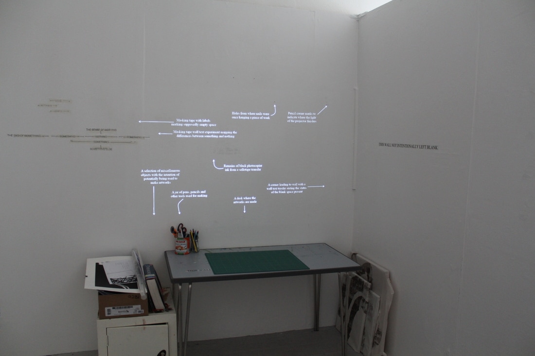
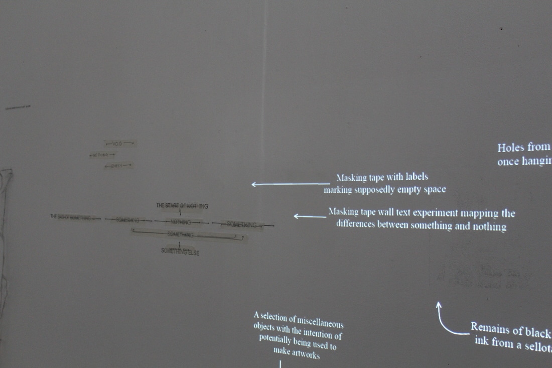
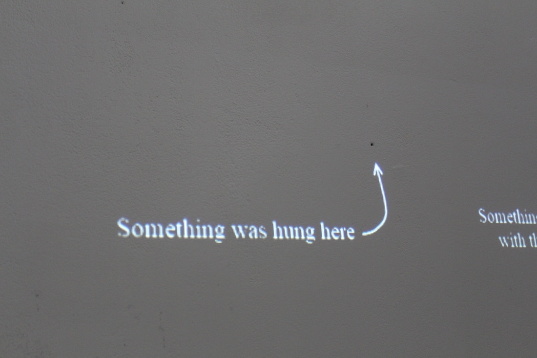
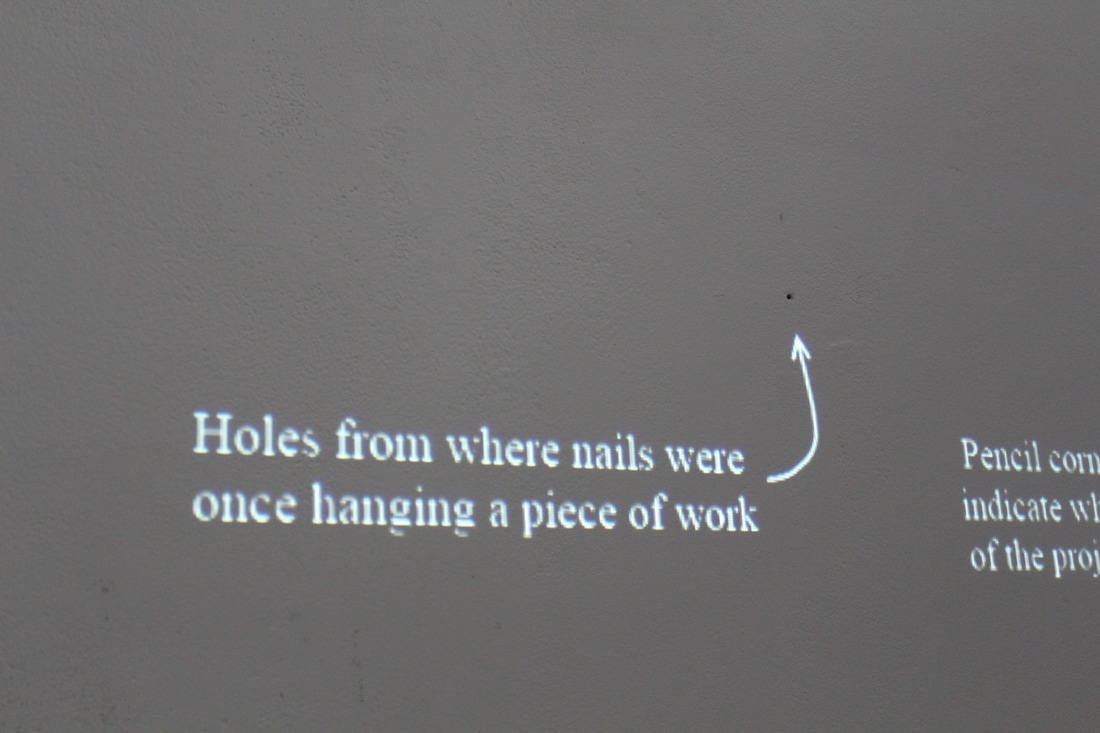
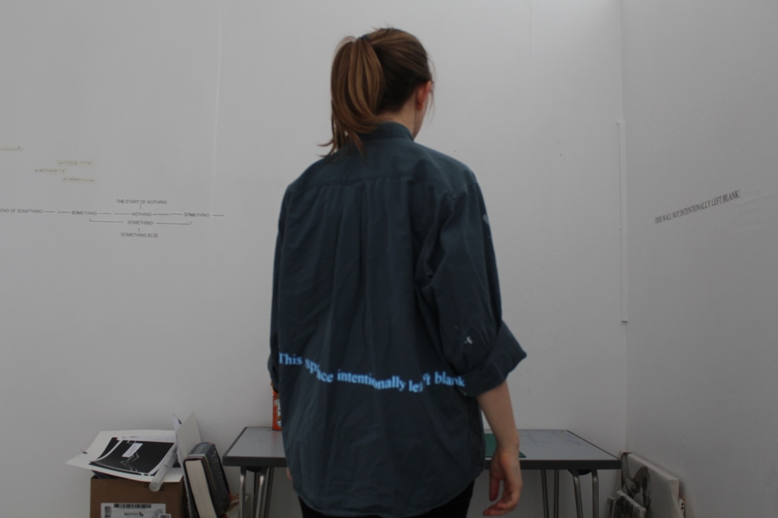
I wanted to develop the idea of the projected wall text further, and made a site-specific installation in my studio space. Taking old work of the wall has left evidence behind, and so I took the time to map out the space using a series of arrows and labels. The installation switches between a set of labels that are descriptive to a set that are more ambiguous, playing with two separate lines of enquiry; the line of someone who isn’t familiar with the space, and the line of someone who is and can identify elements of the space. I also tested how my presence in the space could alter a projected text. By using white text on a black background, the background itself does not appear when projected, giving the illusion that the text is hovering on the wall/ on what is present in the room. It also gives a sense of the installation's temporal nature, and how it will not always remain in that space. After viewing my digital zines on-screen I thought I could push the viewing platform further and try projecting them onto the wall. The change in scale firstly made the books appear much more than an A5 sketchbook where the pages originated from but much more of a spectacle, especially with the pages turning themselves with a press of a button. I filmed the book as the pages turned to see what difference it made to the on-screen version. The combination of projected light and my camera meant that the film picked up a lot of extra colours than just the black and white pages. I photographed the pages as they were turning to capture this colour-shift, and as well as the change in colours there were moments where two pages merged and the texts overlapped or blurred, creating hybrid textual forms. I also tried to materialise my wall texts as projections. By taking the text directly away from the wall, the text occupies more of the space though the beams of light from the projector. The projection occupies the wall because of its proximity to the projector; it's the first thing that the light hits. Yet when the audience enters the space they occupy it, and the light hits them.
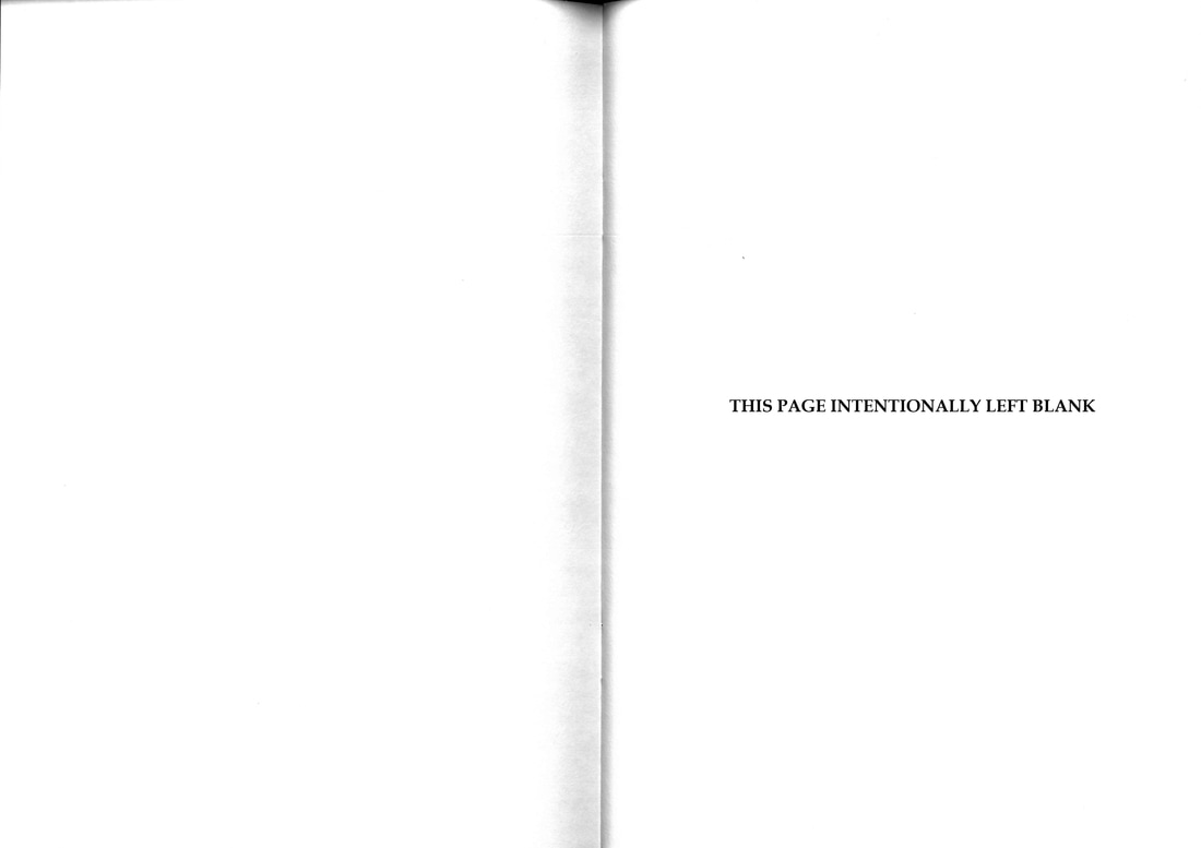
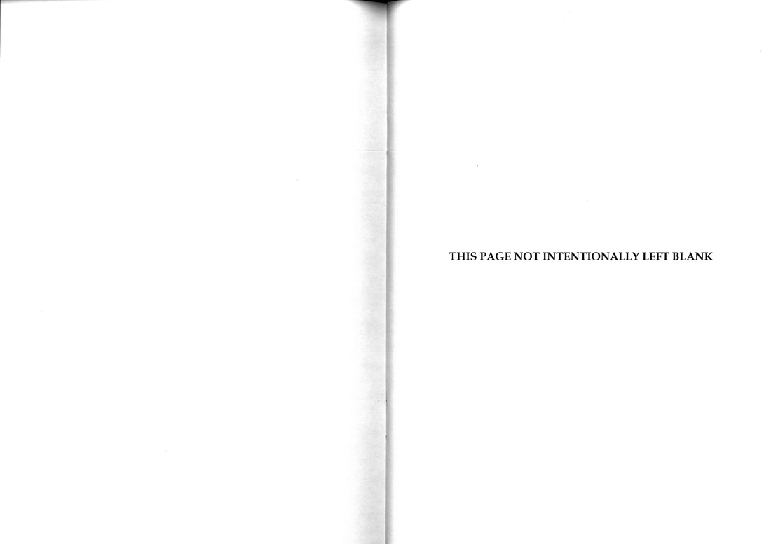
Here, the space is left 'blank' for the audience to occupy and explore the text that can be seen, either on themselves or on the wall. When my sketchbooks evolved to consider the ‘blank’ page, I was drawn to the memory of college examination papers, that occasionally has pages in them that contained no material; only the words “THIS PAGE INTENTIONALLY LEFT BLANK”. This in itself is a contradiction; the page cannot be blank because of the message printed on it, yet the need is there to tell the reader that the page does not contain any other content; if the page were left with nothing on it at all the reader might believe it to be a mistake. So what if the page wasn’t left blank on purpose? What then? It implies that there is something missing; something that should be occupying that page. It gives the impression that we as readers cannot comprehend the reason for a blank page. There must be something on it. The purpose of a page is not to be blank. That is why the message is there to reassure us. “THIS PAGE NOT INTENTIONALLY LEFT BLANK” means exactly that; the page is not supposed to be empty and it isn’t. The message on the page states the exact reason that it is there and is not contradictory unlike the first statement. This leads onto the piece that I made in response to this, using the studio wall rather than the page as the ‘blank’ space. The two wall texts are presented on opposing walls stemming from the corner, similar to the layout of an open book. Like the book pages, one statement is contradictory whereas the other is self-aware. |
AuthorThird Year BA Hons Fine Art student studying at Falmouth University Archives
April 2017
|
